BRAND IDENTITY
Vision & Voice Speaking Solutions with Kym Gable
Brand Identity
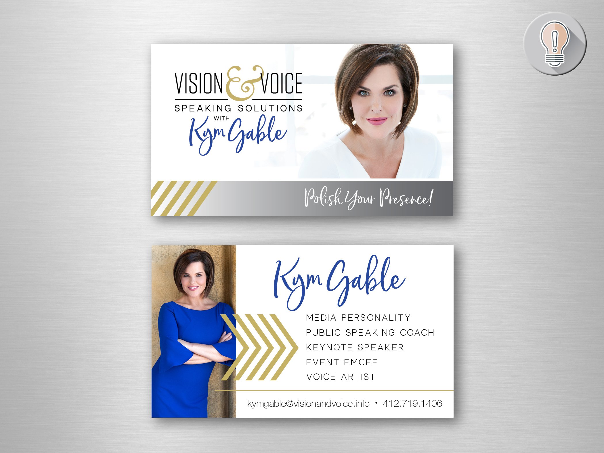
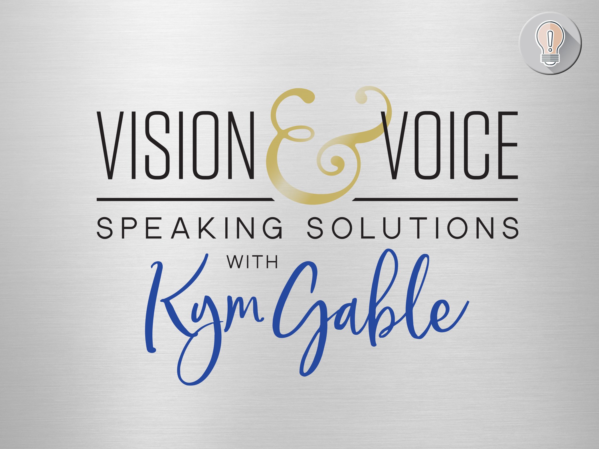
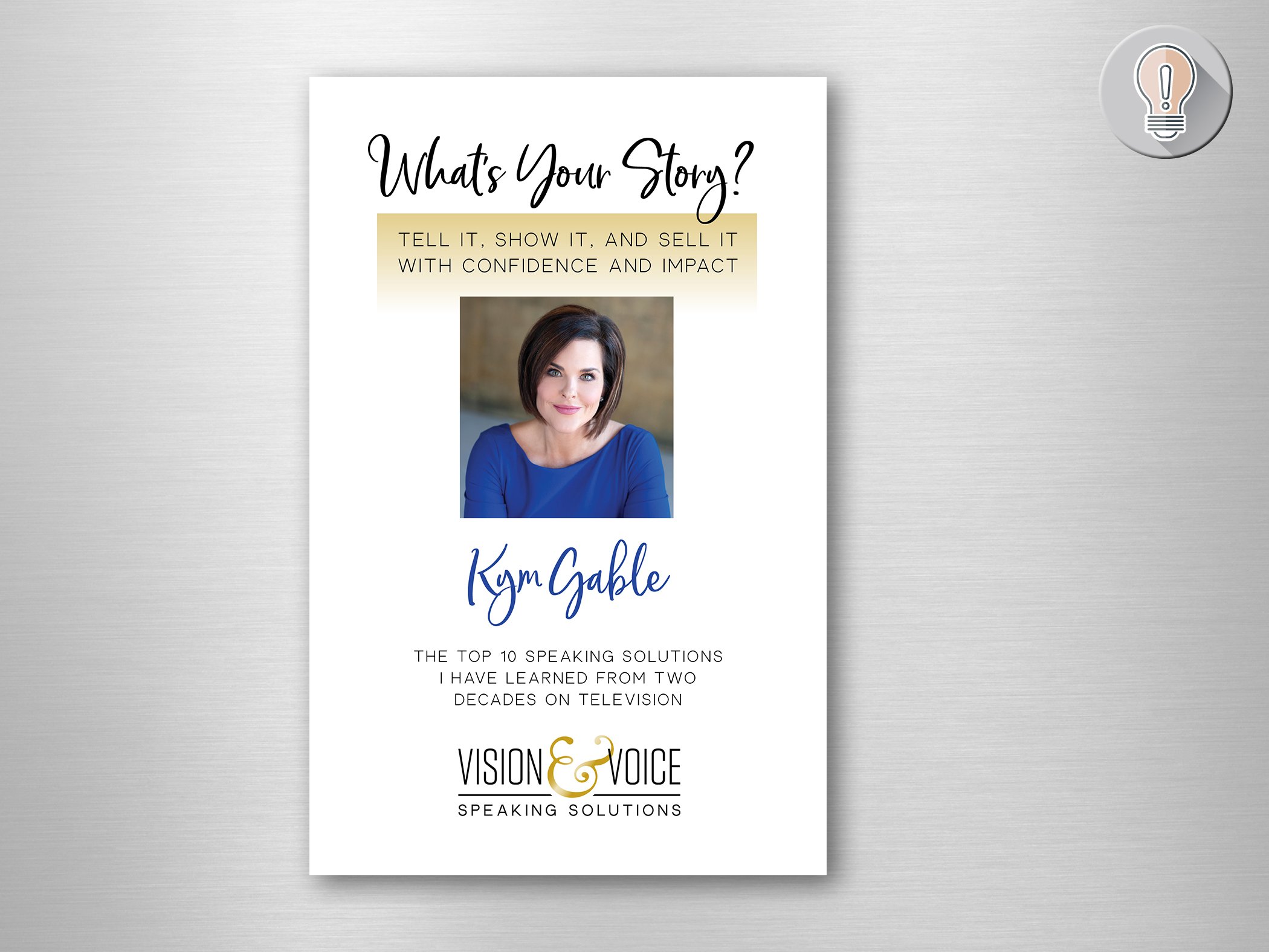
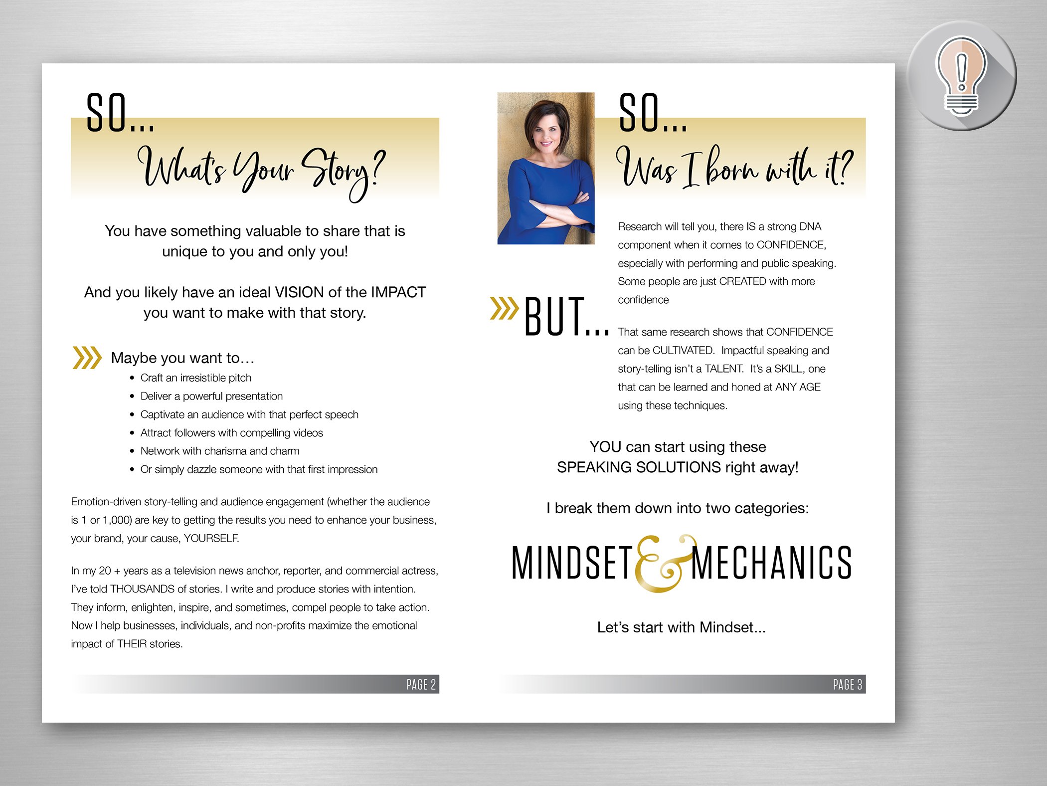
Kym Gable and I met when one of my book authors was speaking at an event in 2018. Kym was working part-time at KDKA TV at the time and was starting a business using her many talents. She knew there were people out there who had a VISION of the impact they wanted to make with their stories. They just needed to polish their presence, and develop a VOICE. And so, I helped her develop a brand identity for Vision and Voice Speaking Solutions!
We needed something personable but modern - something that showed movement and excitement. Using Kym’s signature color (what I can only call “electric blue”) + Pittsburgh’s black and gold, I pulled together a bold, but approachable look that reflects her dynamic presence. Something that gives you confidence that Kym can help “polish your presence” as a performer, speaker, networker… wherever you need to shine!
You can now see Kym daily at the anchor desk at KDKA and she continues her amazing work with Vision and Voice, as well as bringing positivity and charitable works to the city of Pittsburgh and beyond!
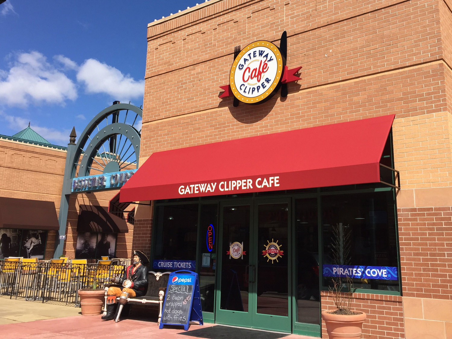
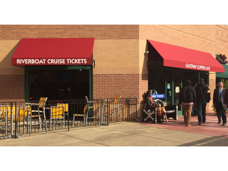
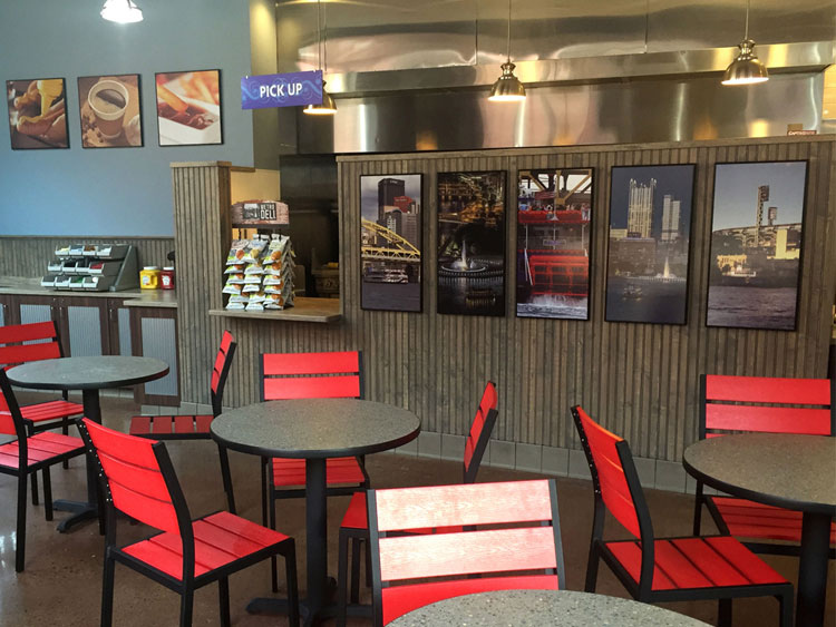
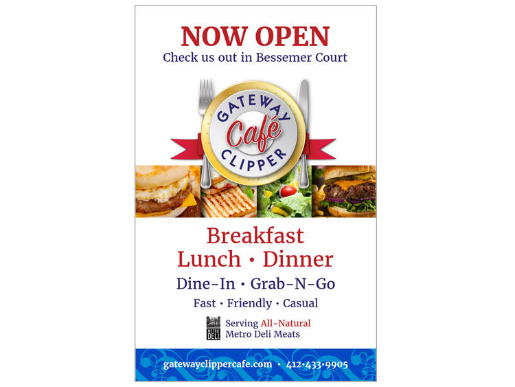
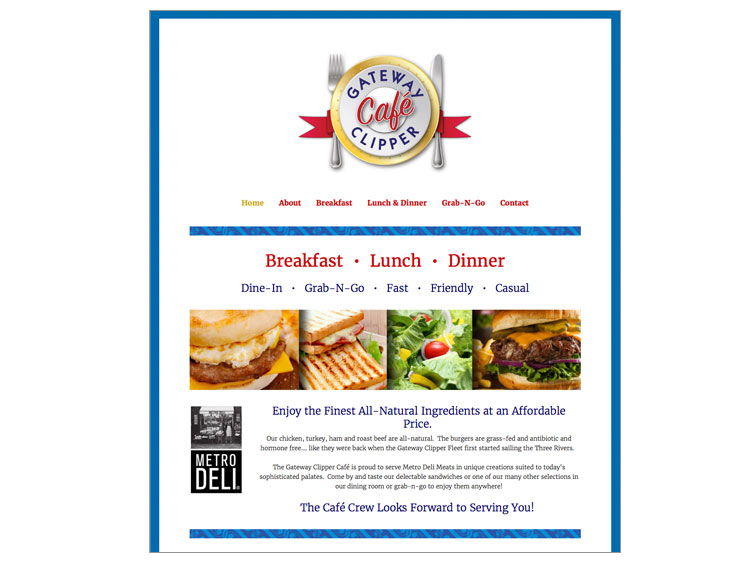
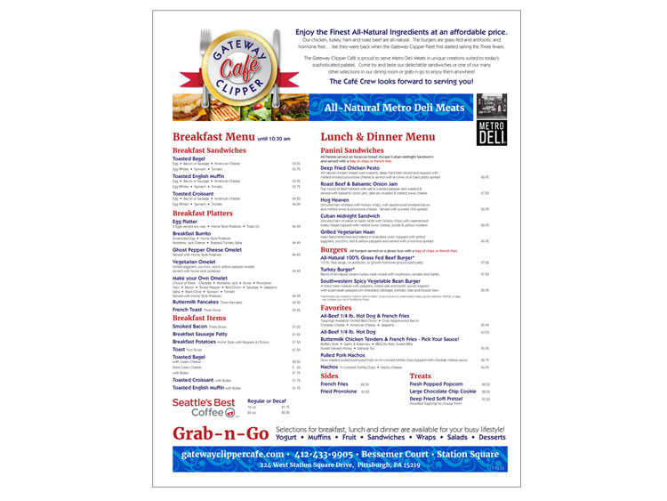
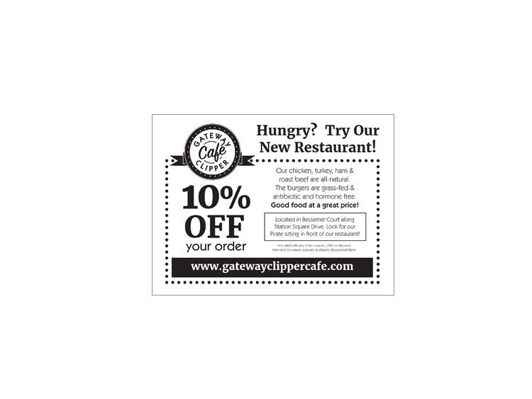
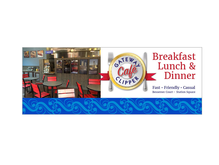
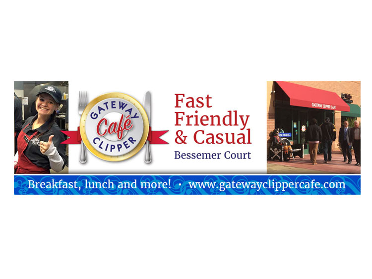
Gateway Clipper Café:
Brand Identity
A project that combines the legacy of Pittsburgh's Gateway Clipper Fleet with an exciting new restaurant.
I picked up the "portfolio" element from the Gateway Clipper Fleet's logo and turned it into a plate to honor the legacy but convey "dining". I also did a take on the blue stripe that is an ornament on the Fleet's boats to tie the restaurant to the originating company.
I put together the interior signage including framed pieces and directional signage. I also designed the exterior graphics, pulling together the resources to produce the window graphics, awnings and lighted signage.
The president's comment upon approval of the package?
"Well, that was easy."
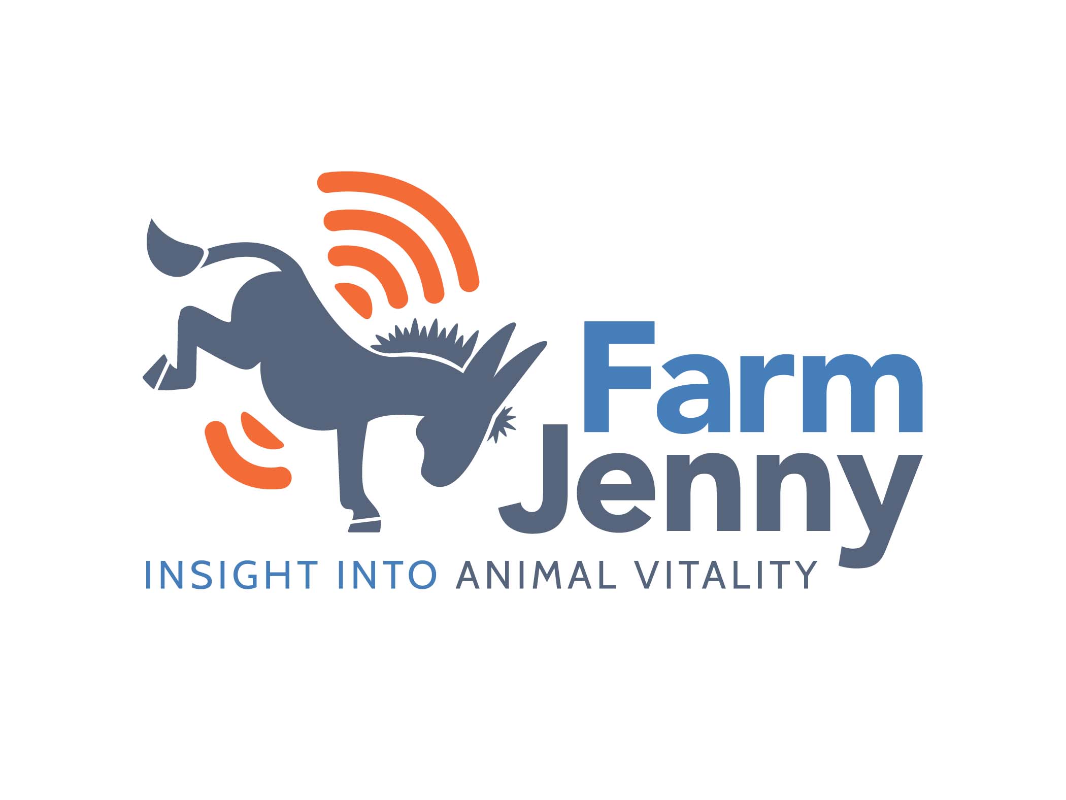
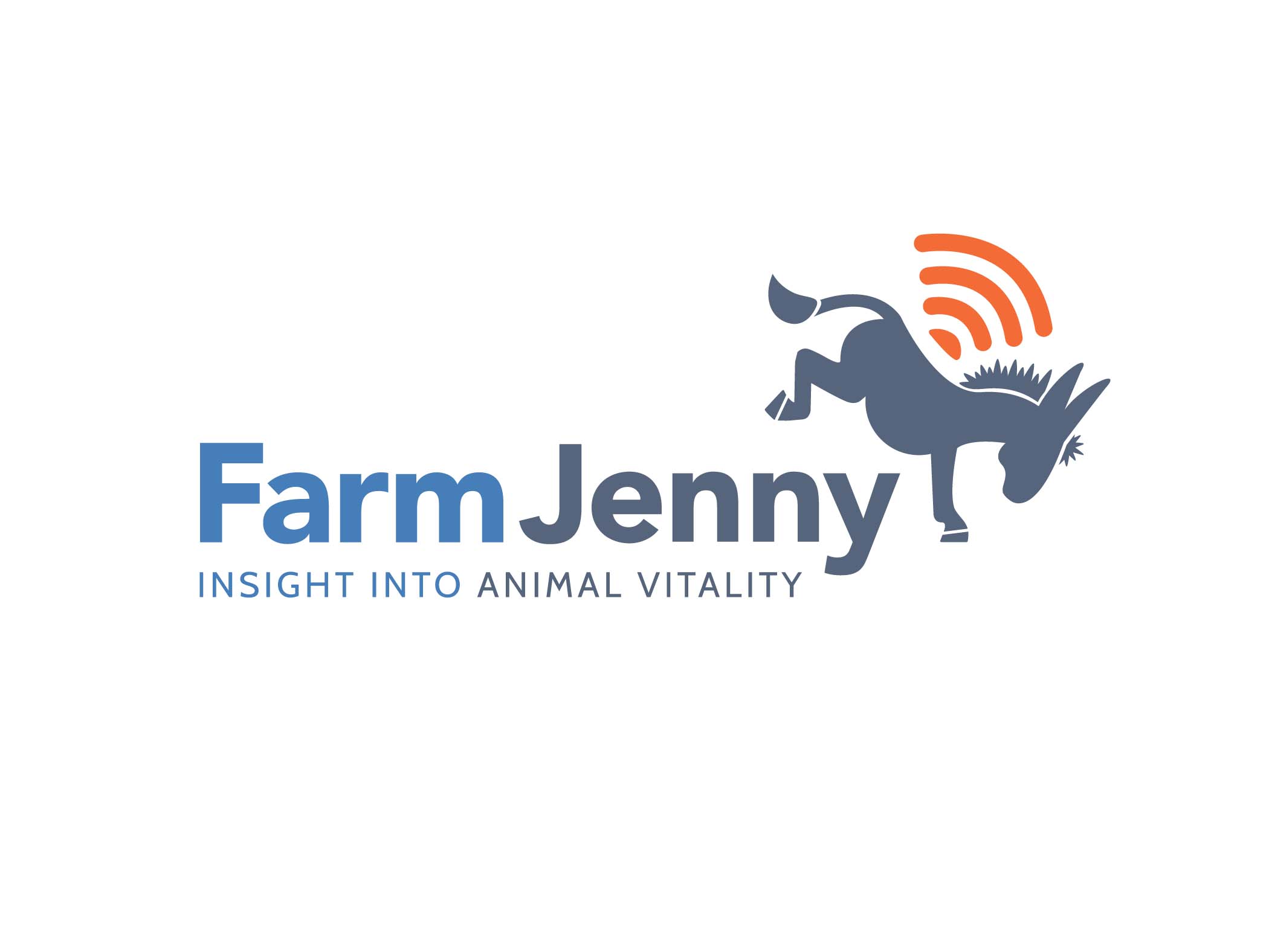
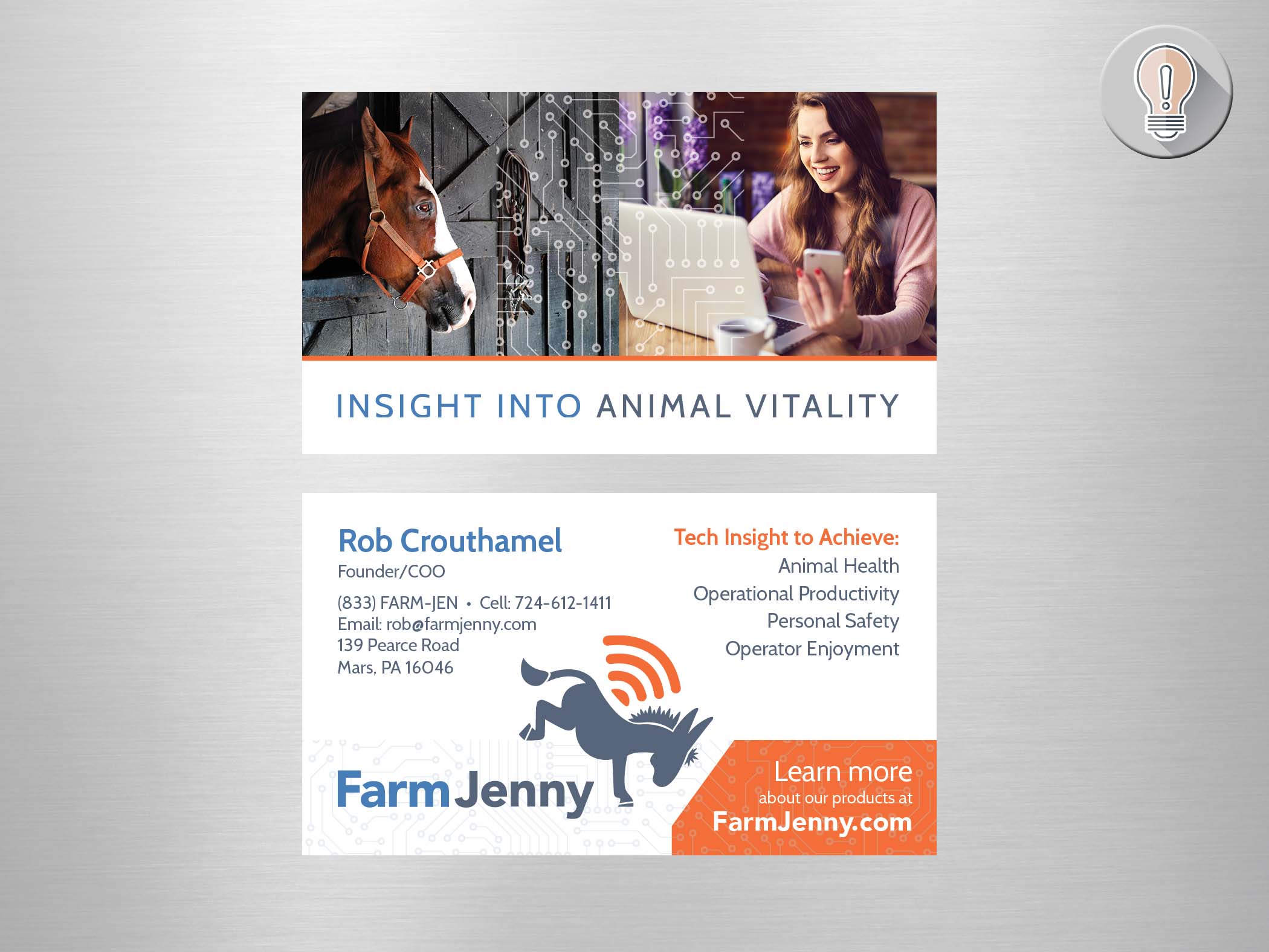
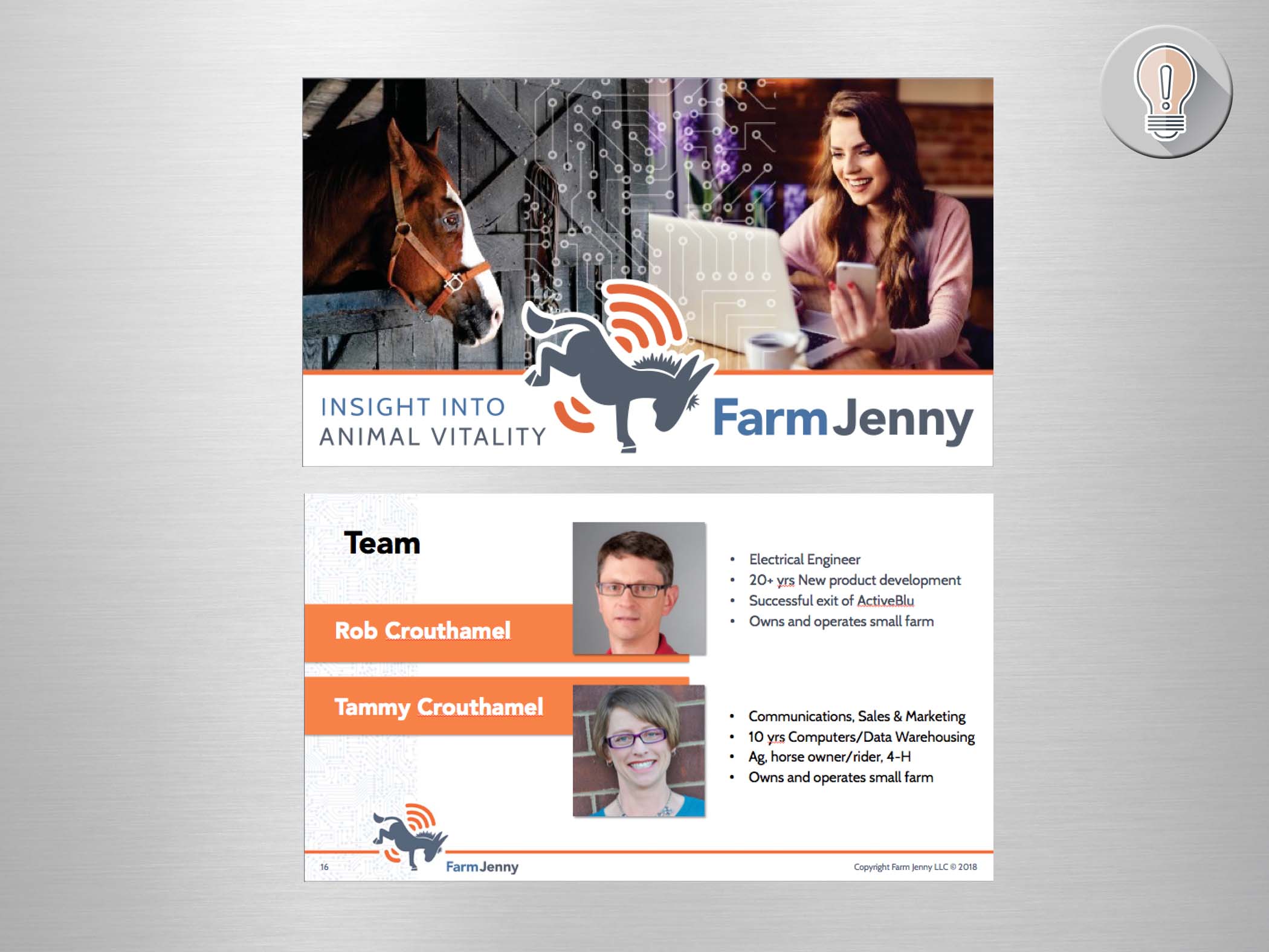
Farm Jenny:
Brand Identity
This startup is using technology to track animal vitality. A Farm Jenny is a female donkey who - with her large ears is the first to pick up on incoming danger and sound the alarm. Thus the donkey icon with the wifi signal.
A big challenge was using a donkey without a political connotation. I created the donkey in a kicking stance to indicate the protective nature - plus that's not the most common way to see the political icon. I also gave her a very rounded appearance. I also had to make the icon strong enough to hold up when reduced in size to be embossed on the product.
As far as the color palette, I stayed away from flag colors - and gave them a grey/blue base with a strong orange for the "alarm".
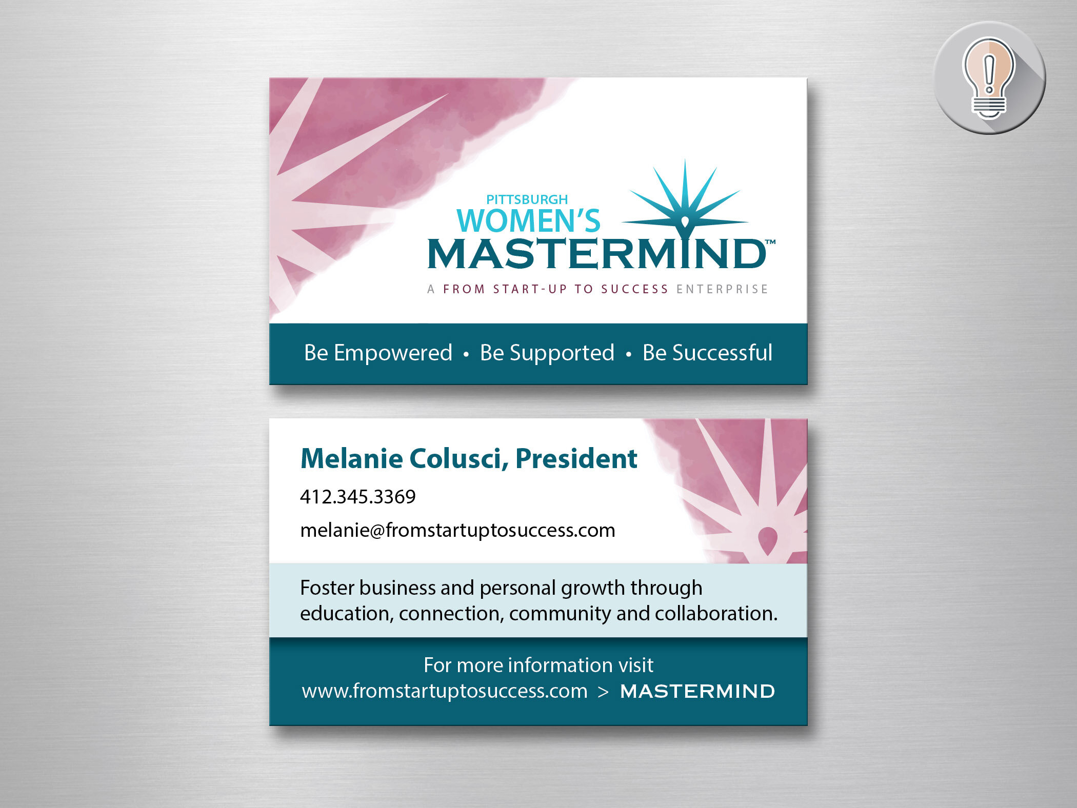
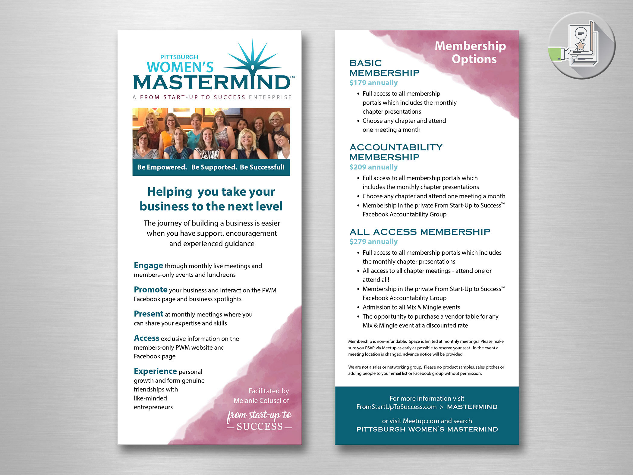
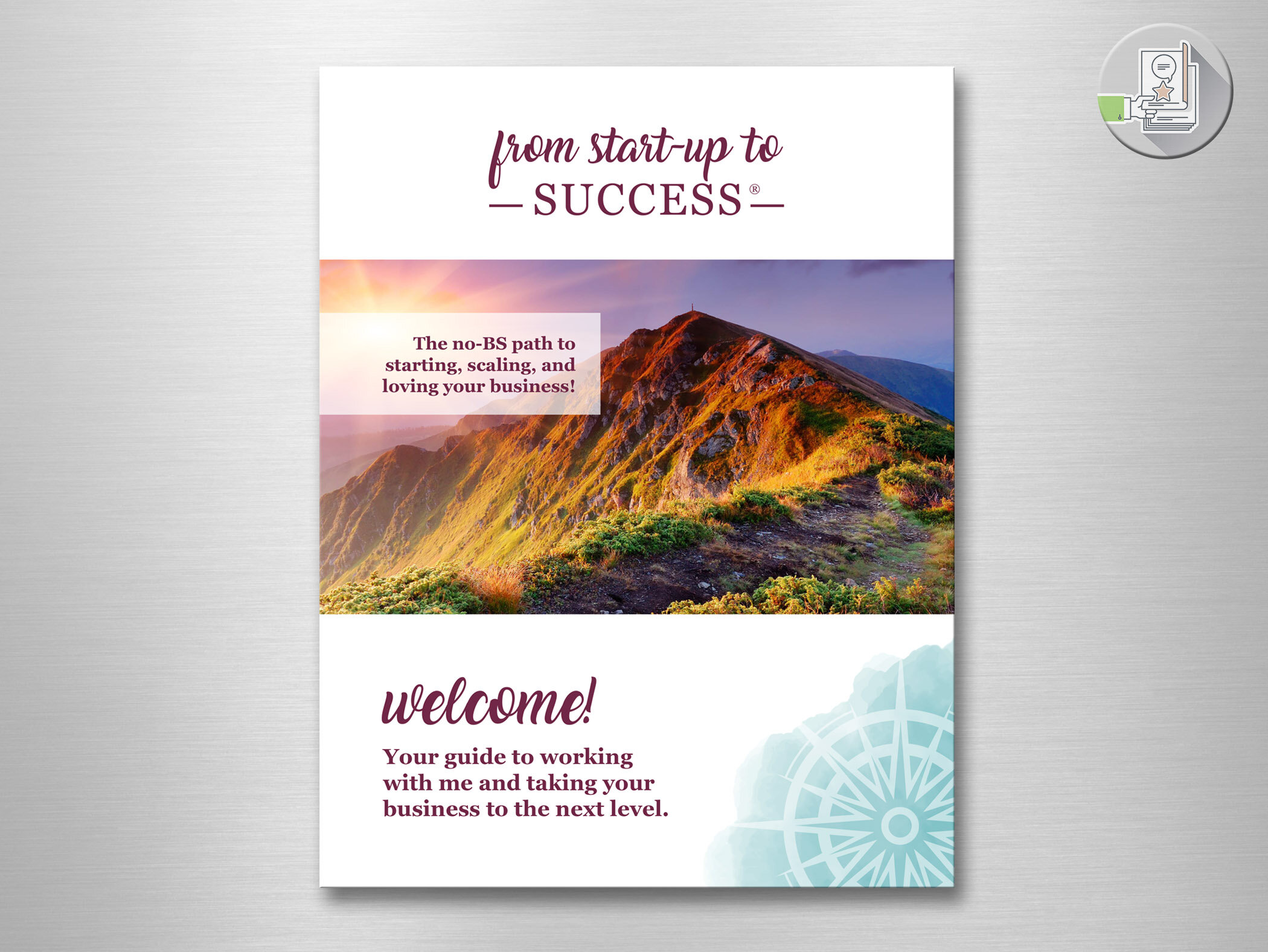
From Start-up to Success & Pittsburgh Women’s Mastermind:
Brand Identity Unification and Expansion
THE CHALLENGE: Unifying sister brands from two very different logos I didn’t create.
The business owner wanted a soft look, so I came up with a watercolor effect that would play up an icon that would be unique to each brand. The water color shapes and colors would accent each brand… burgundy being the primary color for From Start-up to Success, and teal being the primary color for Pittsburgh Women’s mastermind. Then I used the primary color as the secondary color for the other brand. One brand featured script and serif fonts, while the other features sans-serif fonts. A delicate balance for unified brands.
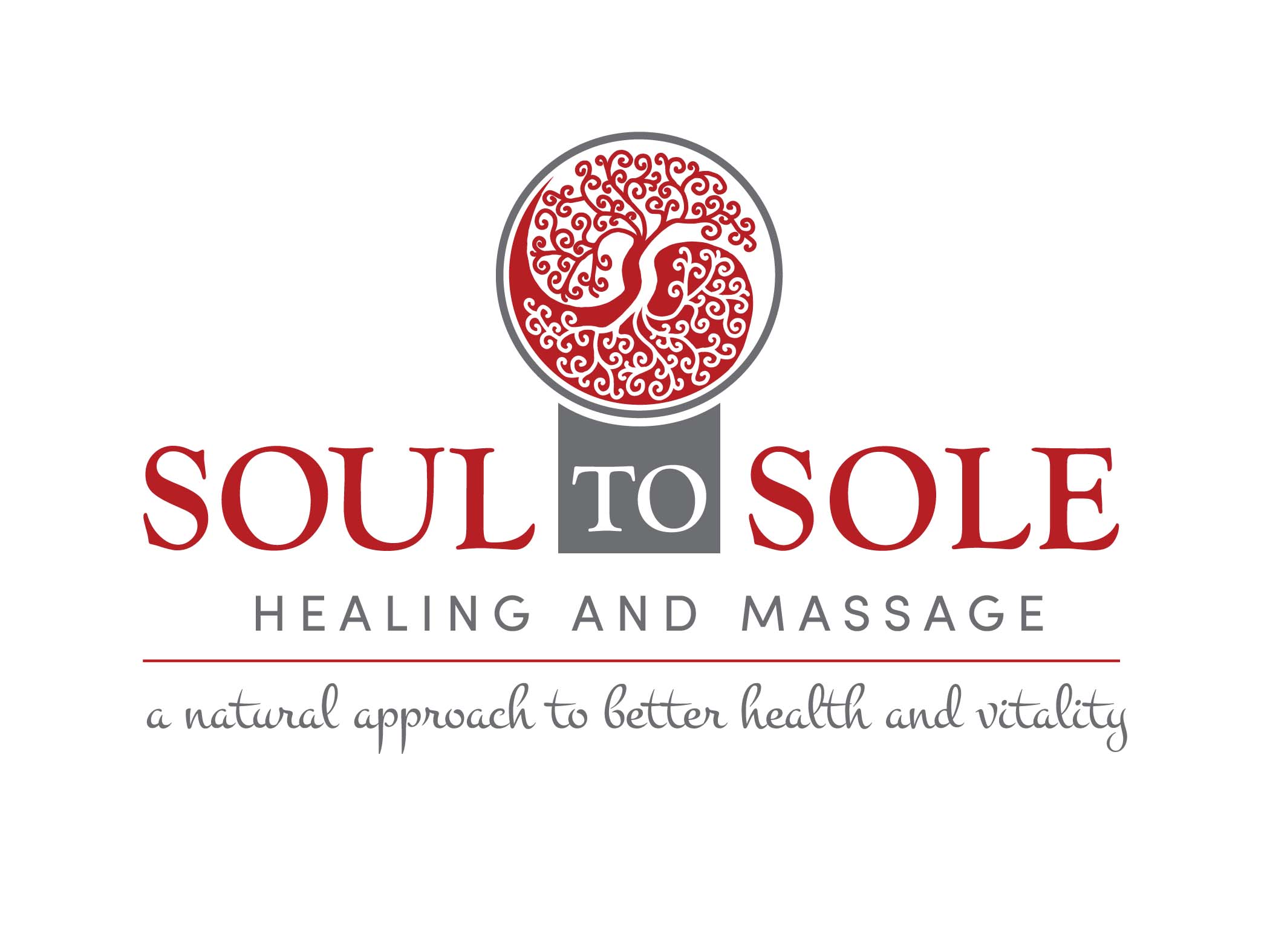
Sole to Soul Healing and Massage:
Brand Identity
These enterprising ladies recently opened a space in a Chiropractor's office to practice their healing arts in the Castle Shannon, PA area. I had the unique opportunity to take a drawing one of the women had done and create a logo around it. I had to reproduce her art into the proper "vector" format, and it was one of my first projects with an "apple pencil". It was really the best way to create the organic look they were seeking.
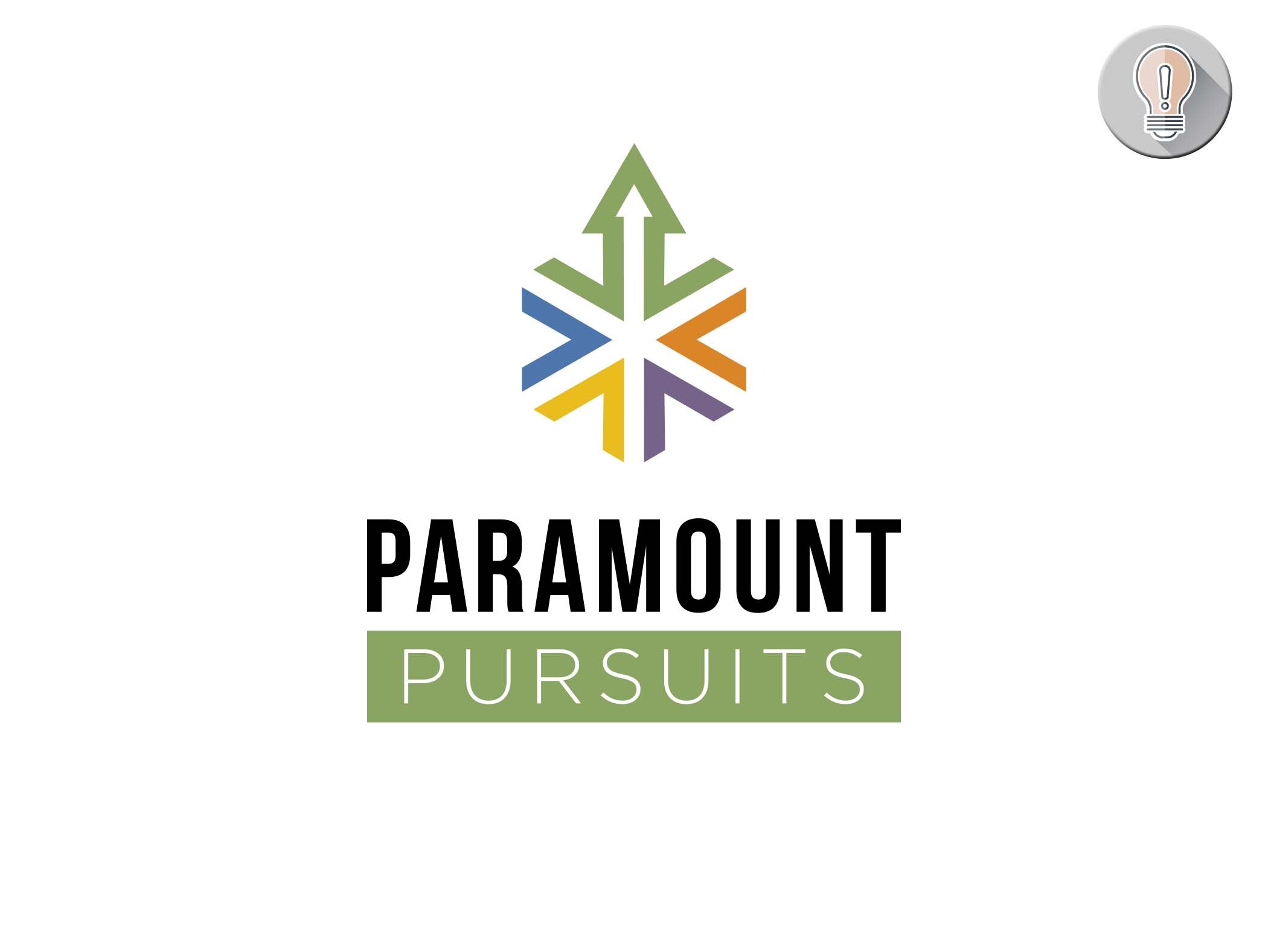
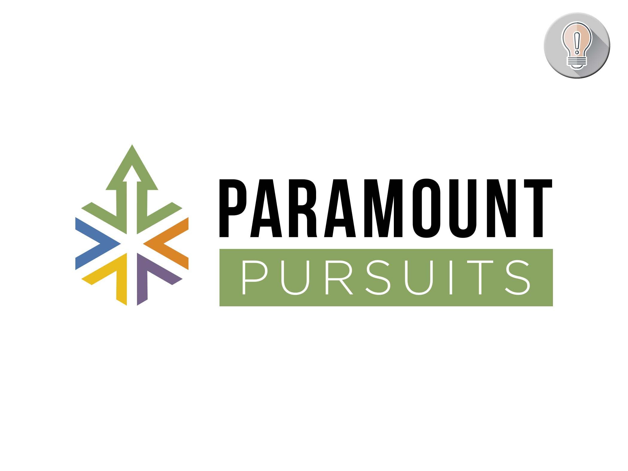
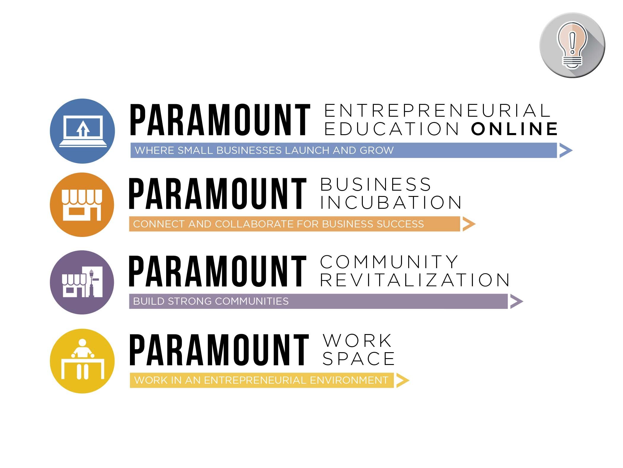
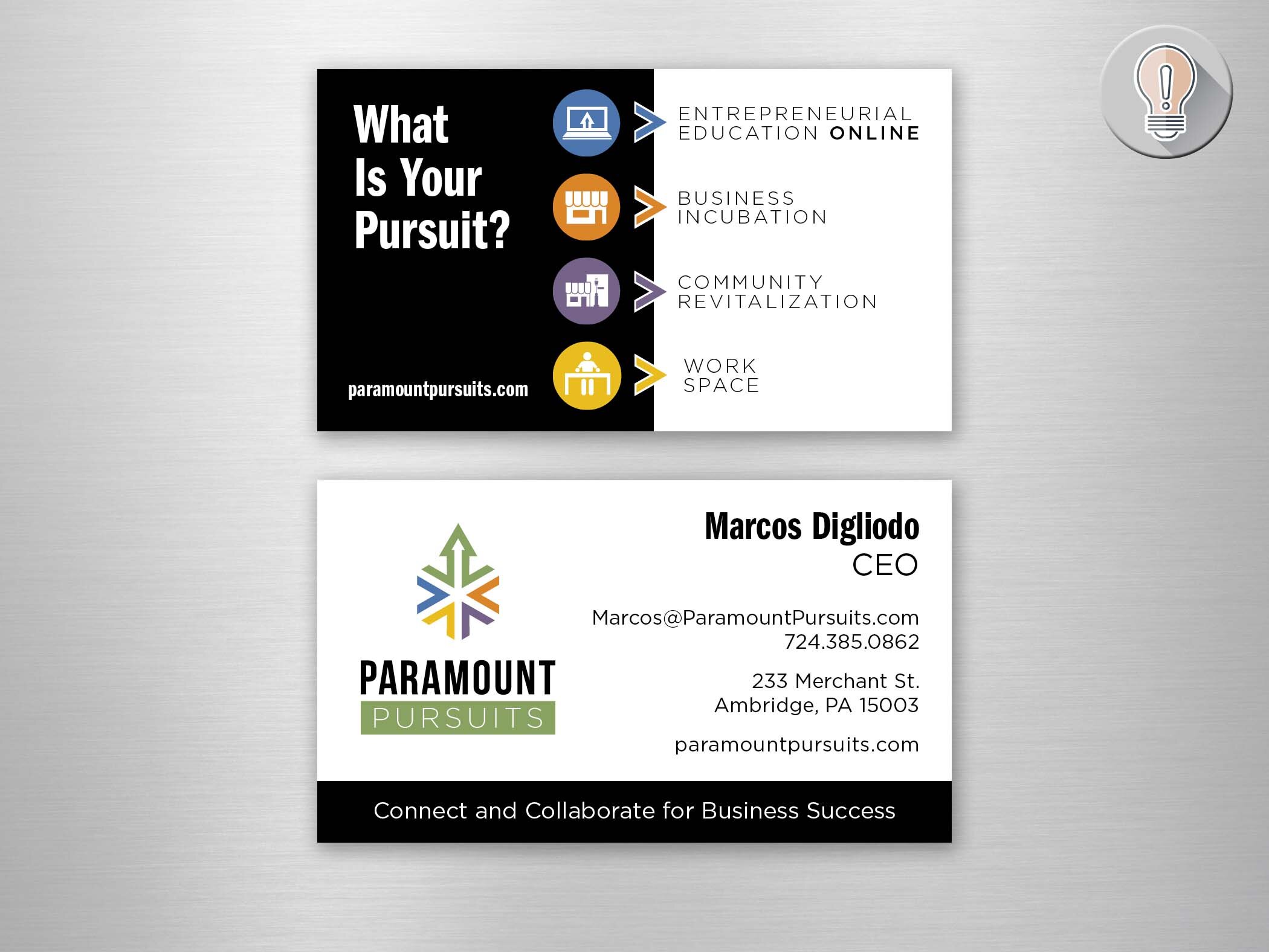
Paramount Pursuits:
Brand Identity
The company that had been Paramount Enterprises wanted to rebrand. I pulled in Deb Herman to work with me on the content and we were off to the races. They had several loosely defined segments - and they were adding an online aspect - Called Paramount Pursuits. Deb and I looked at each other and non-verbally acknowledged to each other that Paramount Pursuits should be the over arching brand. After reviewing their services we came up with four sub-brands that gave definition to their different pursuits to help their audience focus on what was most important to them.
In the end, we asked the audience, “What is your Pursuit?
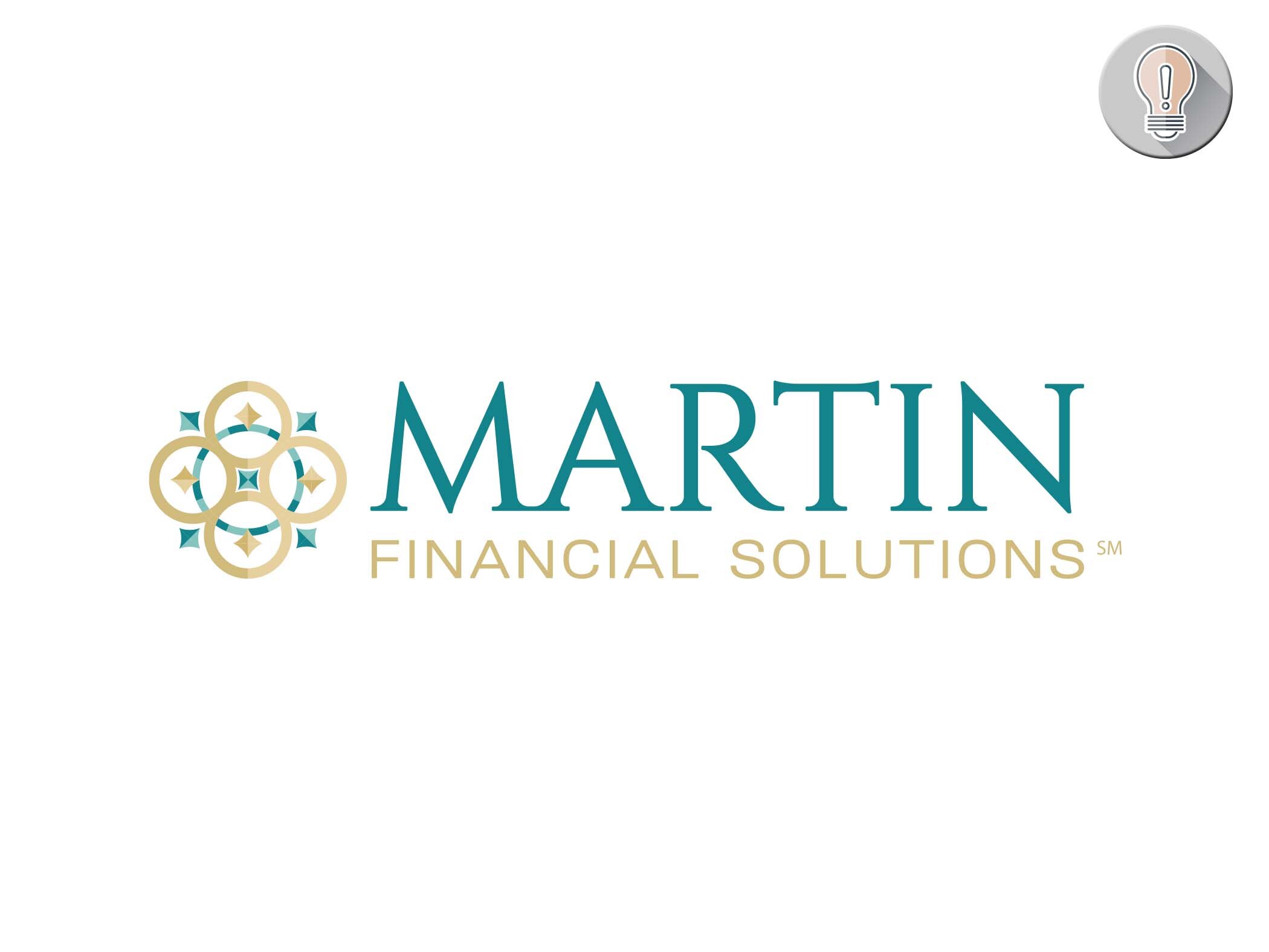
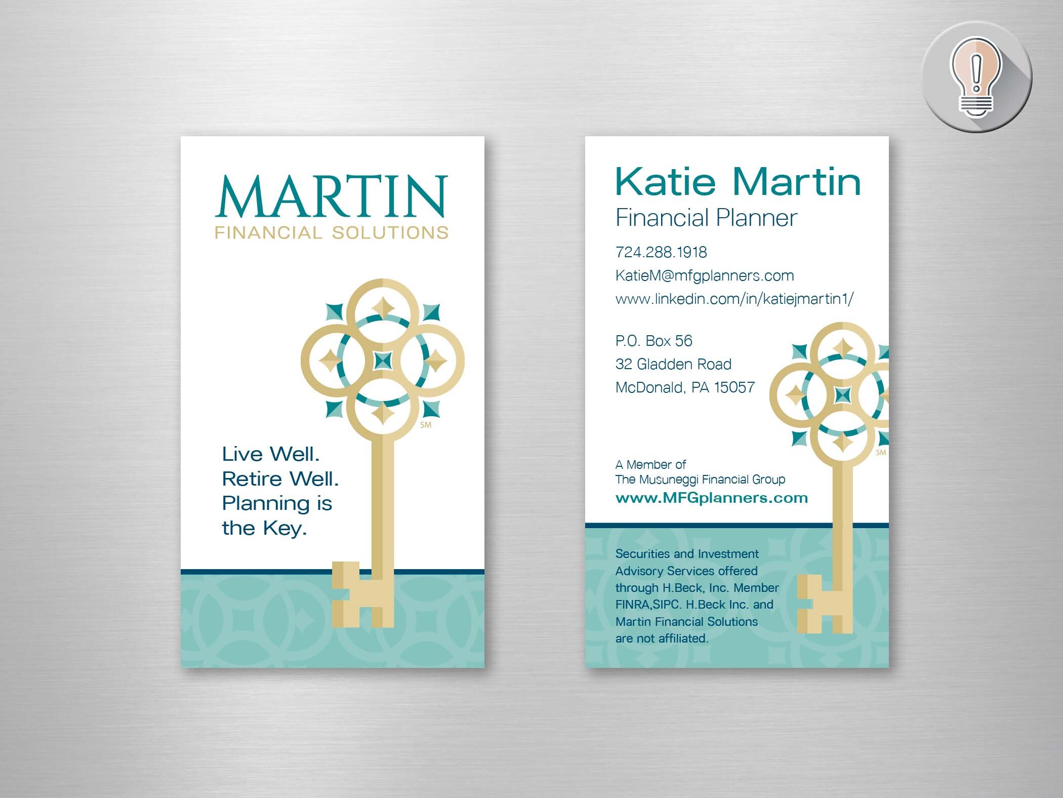
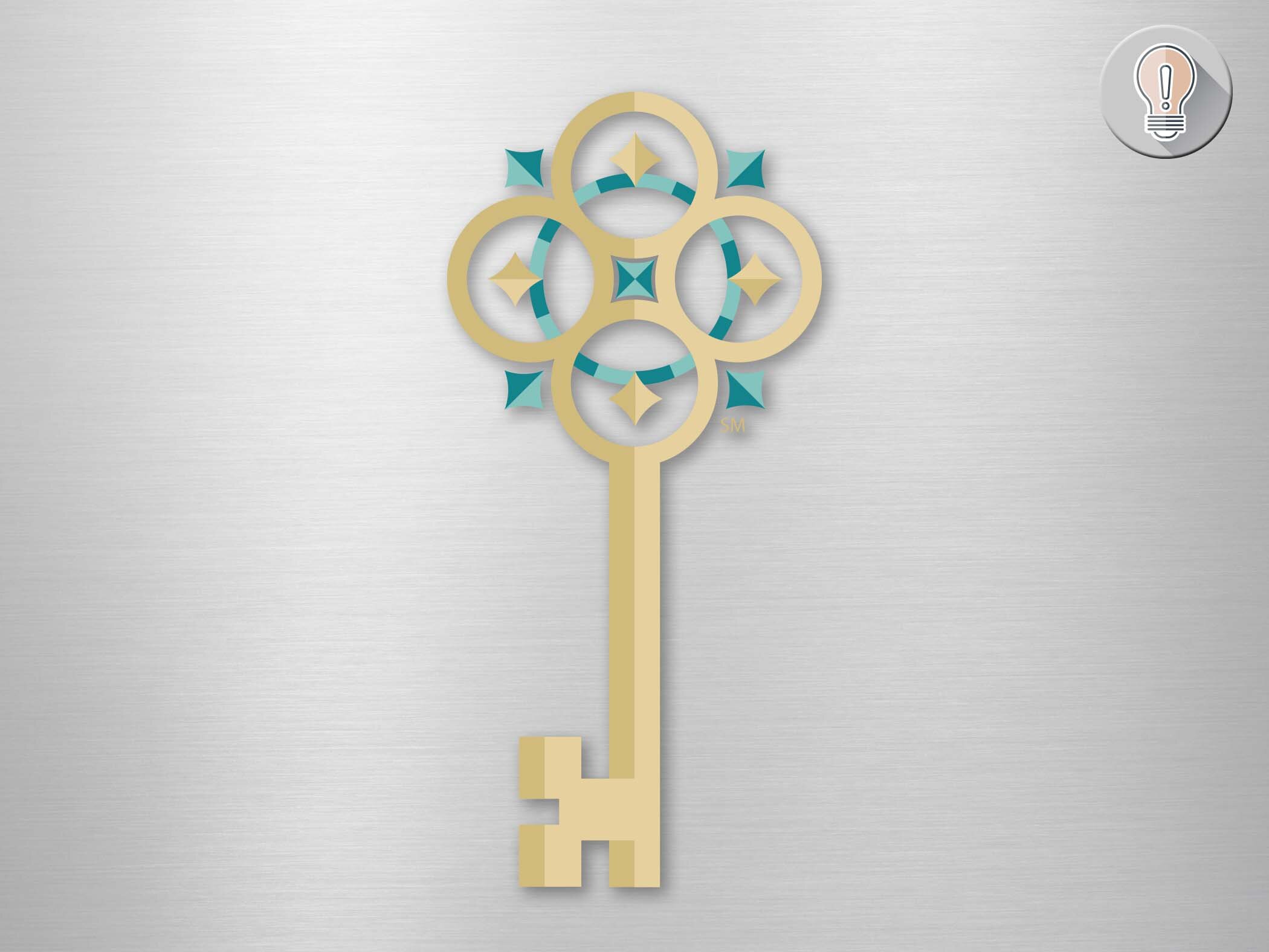
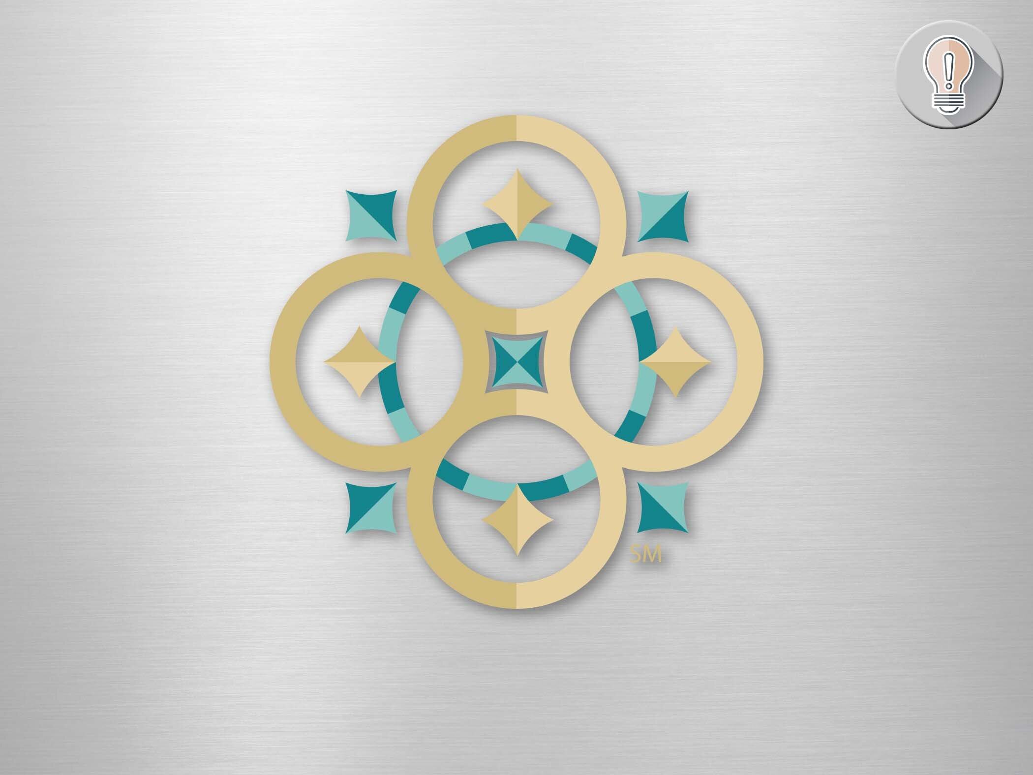
Martin Financial Solutions:
Brand Identity
Katie Martin was making changes to her work life - bringing the main operations of her practice into her home. She was a trend-setter, huh? We worked hard honing her message - the key to which was a key! The design of the top of the key has meaning as well. What do you do when you’re lost and need to change direction? Grab a compass!
So…Martin Financial Solutions is your key to find your way to living and retiring well.
The colors are pure Katie, and luckily worked for this application. The rich gold offsets the unique teal that Katie wanted. An accent of navy blue grounds the palette and completes the look. A visit to her office makes your feel like you are living within her brand!
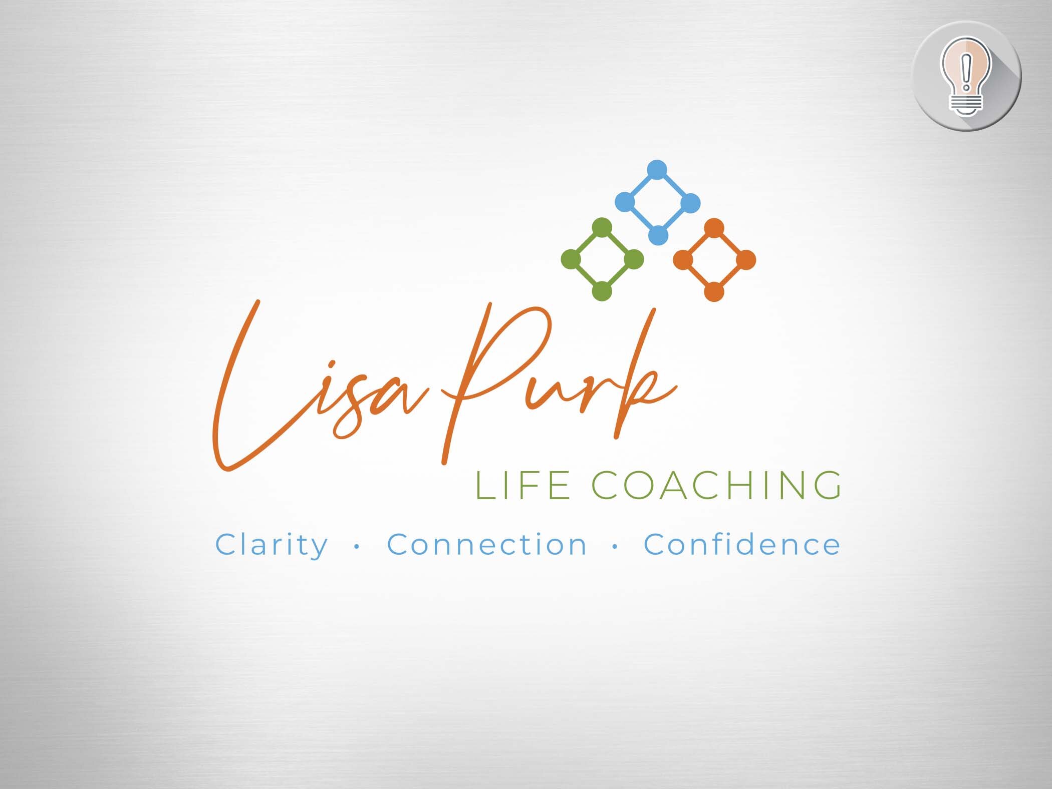
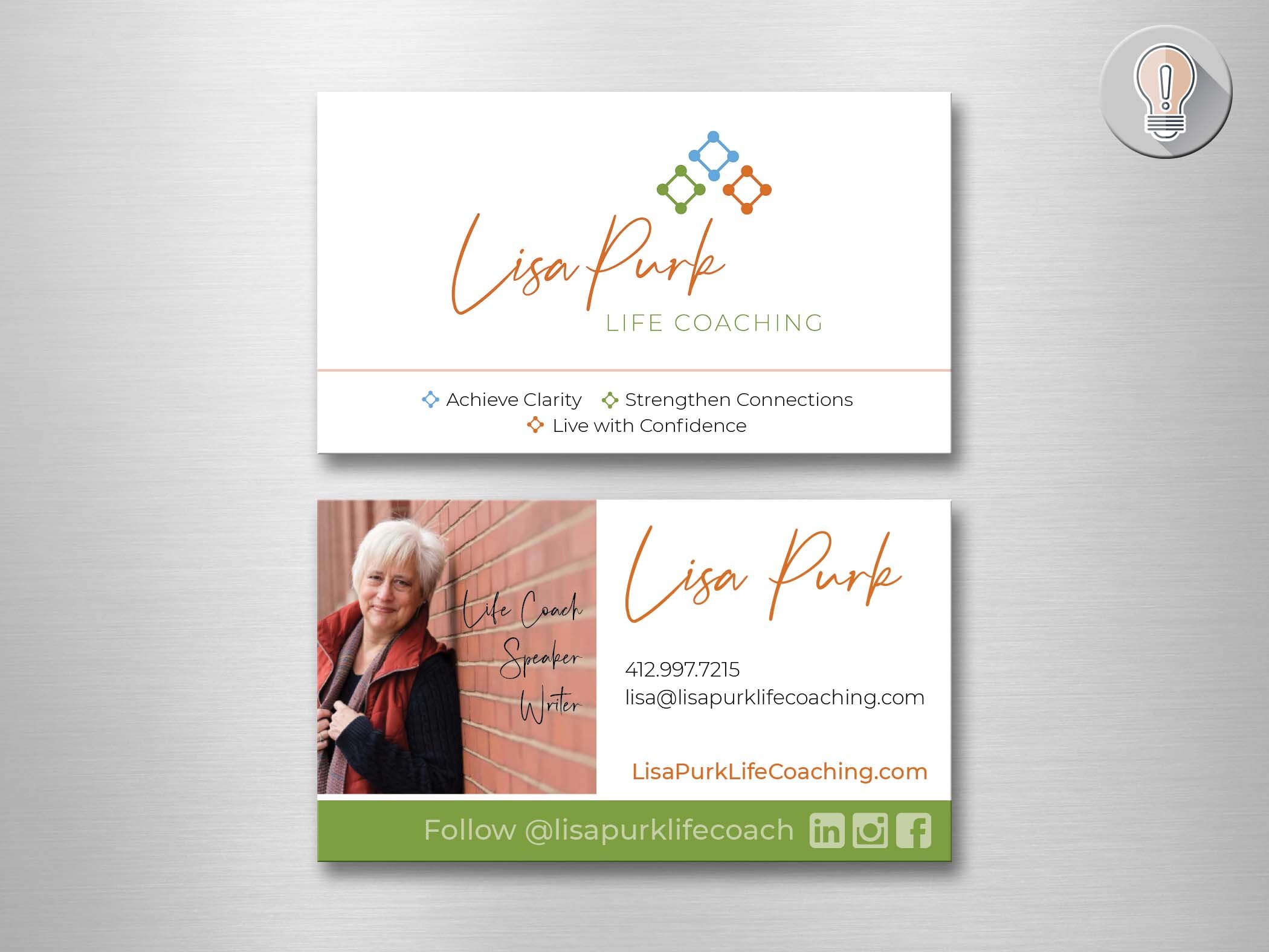
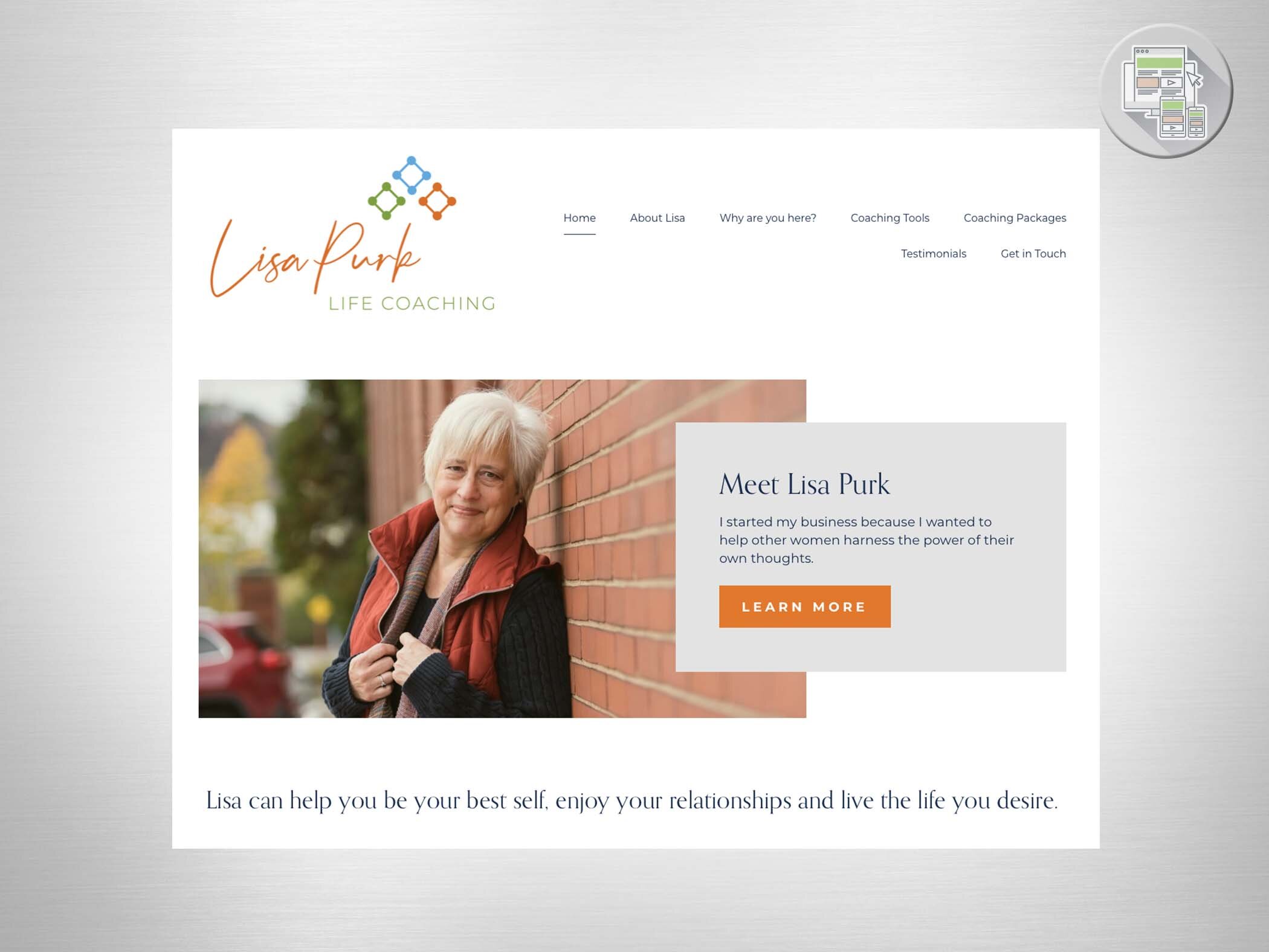
Lisa Purk Life Coaching
Lisa Purk had been clinging to her old branding and decided to break away to something that felt right for what her brand was NOW. Lisa Purk IS the differentiator in her coaching business, so her name became her brand. Clarity, connection and confidence is what Lisa brings to her clients, so those were the key words we focused on.
As I thought of connection and clarity - “connecting the dots” came to mind. So I gave her some dots and connected them! The three sets of dots represented her three key words - and so the three colors would represent those three areas. Then I placed them into a subtle upward arrow pattern to indicate the upward trajectory her clients’ lives would take!
Lisa now has a brand that fits her and her business!
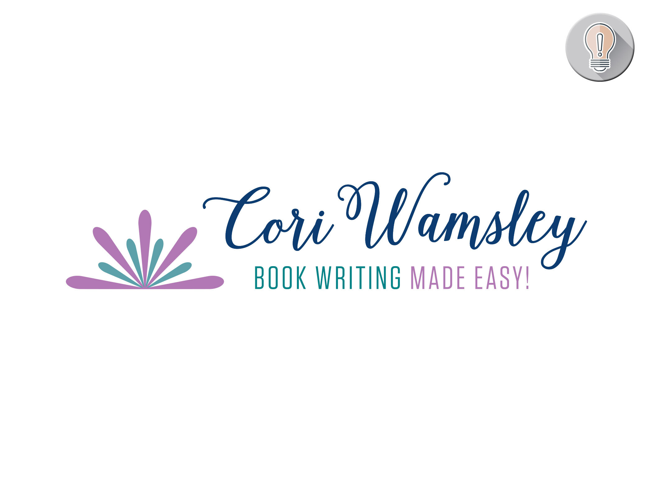
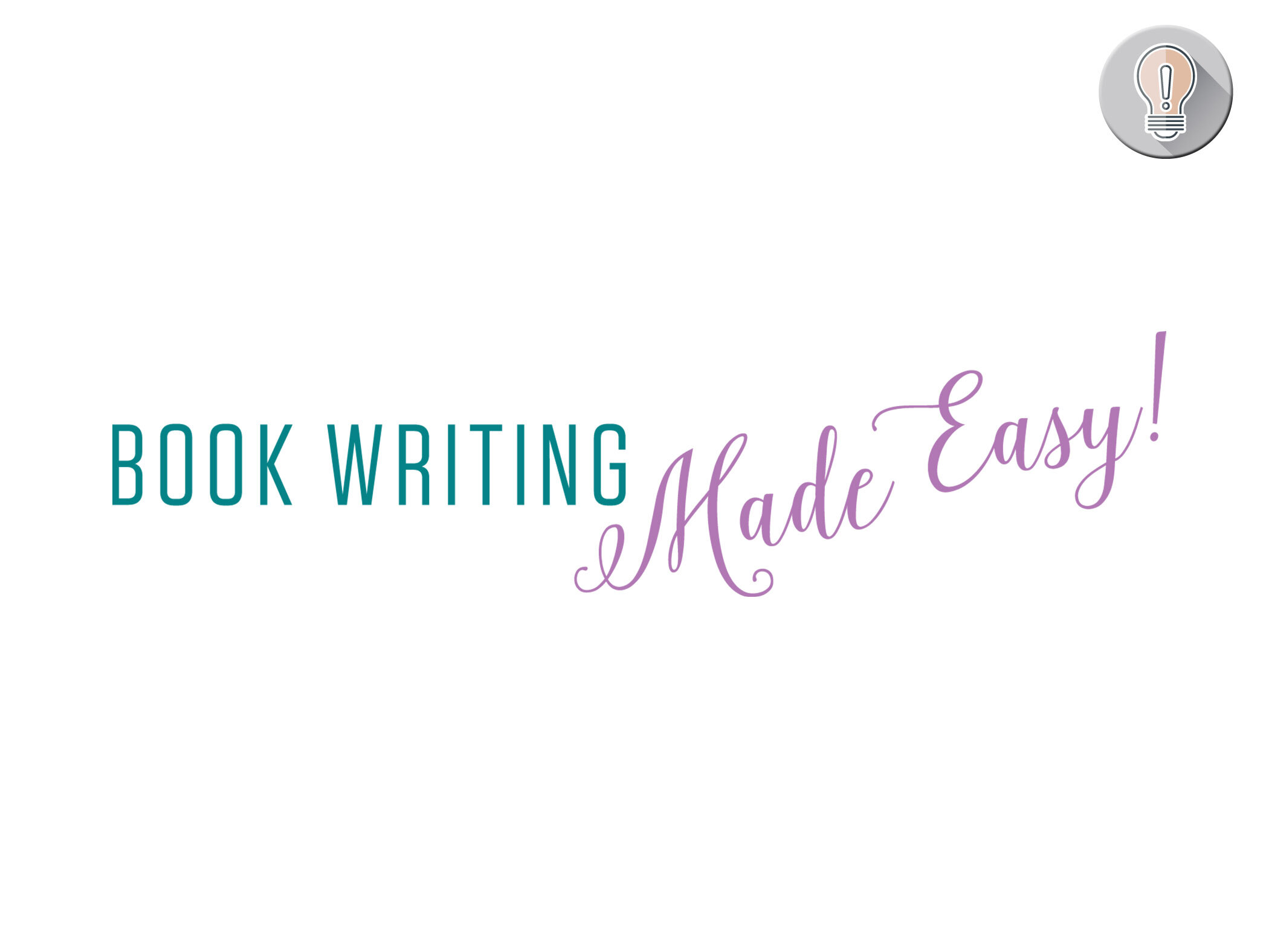
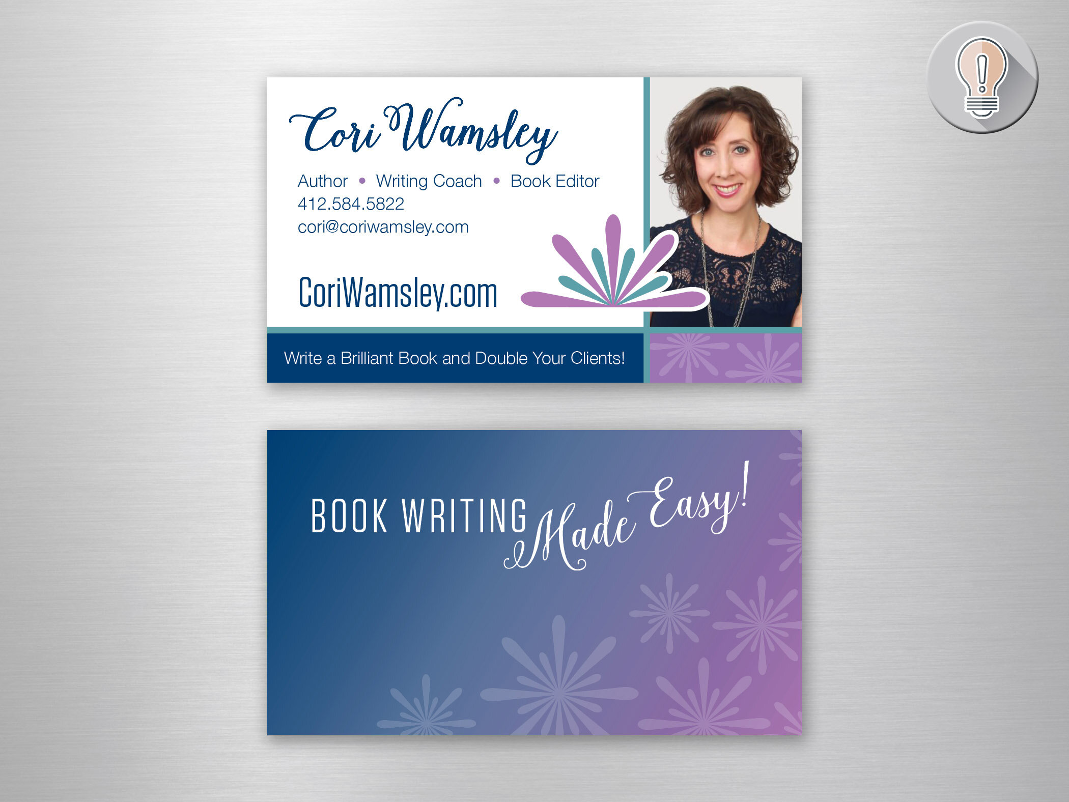
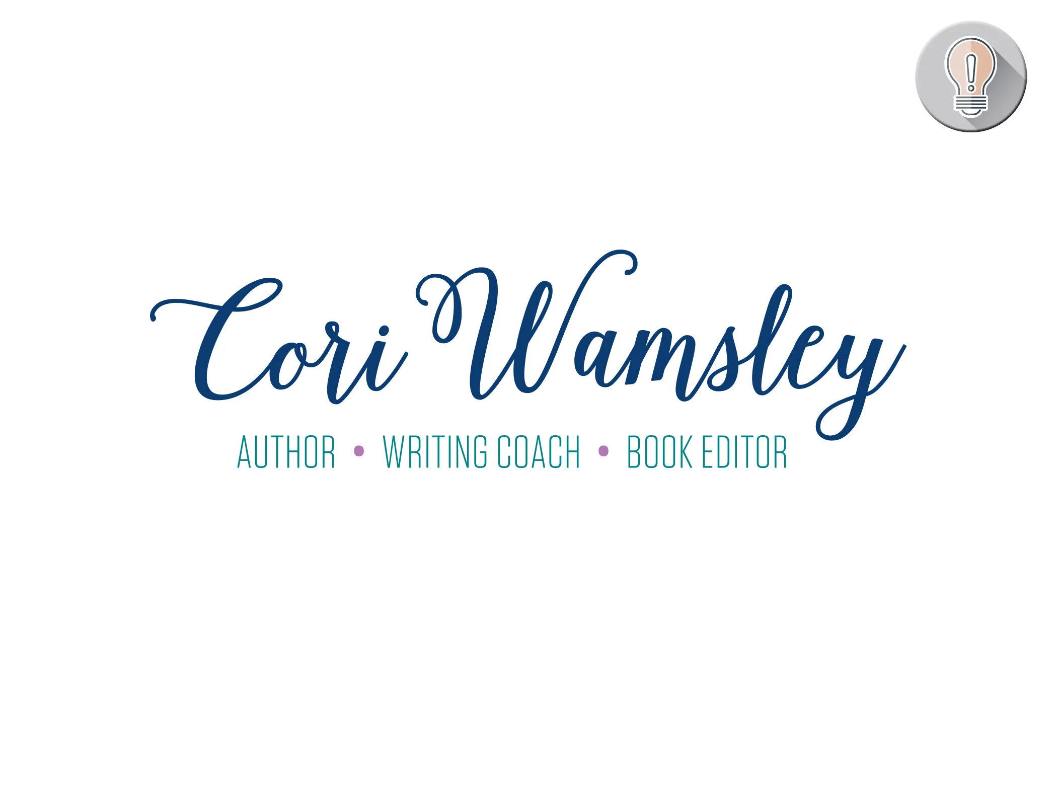
Cori Wamsley:
Brand Identity
Cori is a dynamic, motivated woman who brings a touch of magic to her what she does. She wanted to convey professionalism with a touch of fun and whimsy. Her SPARK method of book writing inspired the firework/spark image… and the fan implies the fanned pages of a book! The palette was carried over from colors she has used in the past - creating a smooth transition to her sophisticated and fun new look!
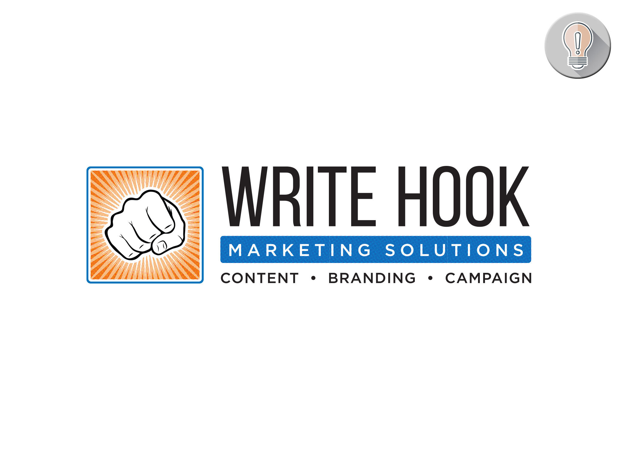
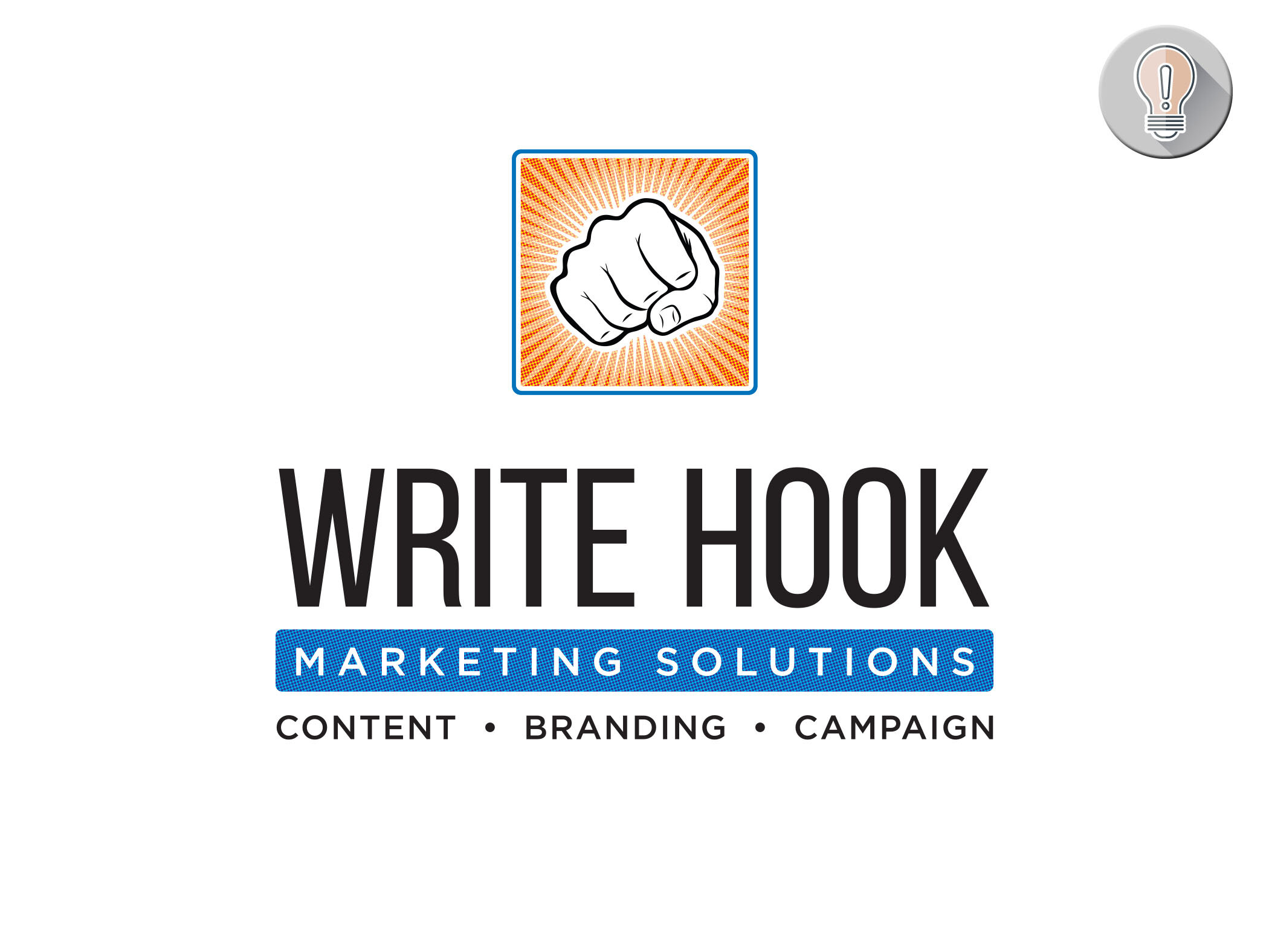
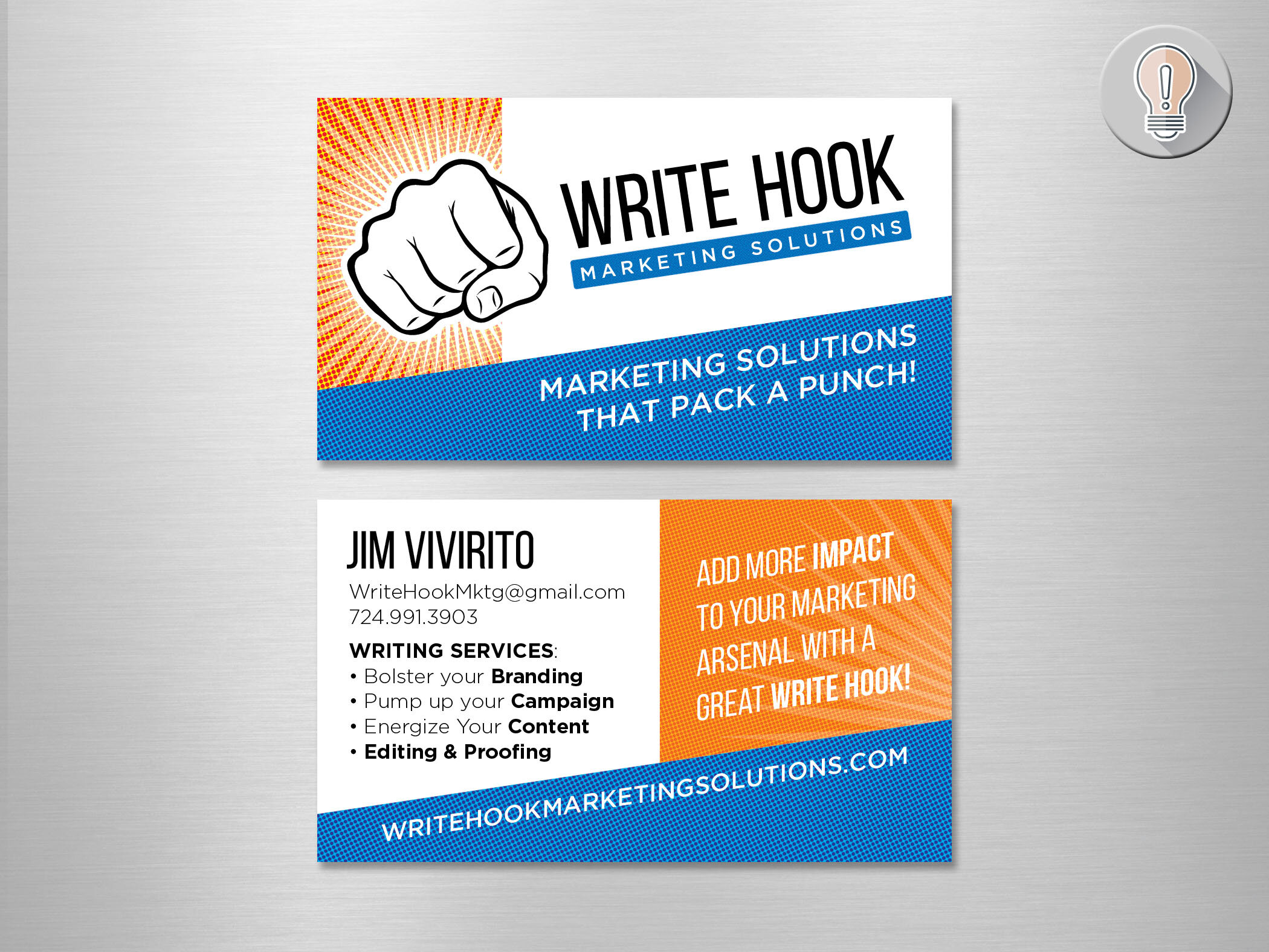
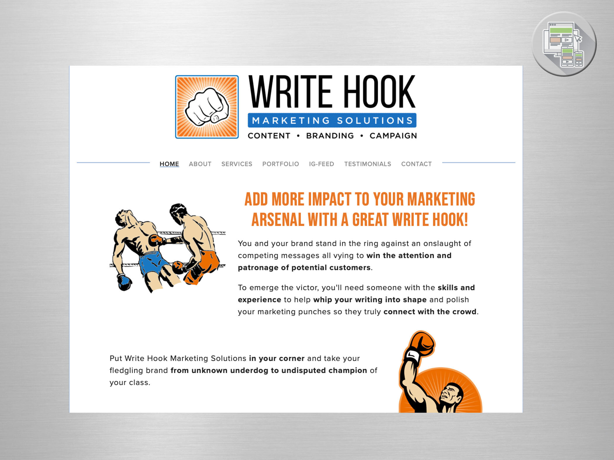
Write Hook Marketing Solutions
Brand Identity
Jim had been doing freelance for quite some time, but never put a brand around his business. He had a head start and a good handle on what he wanted to say - he IS a writer after all - so we just had to pull it together. Jim and I love wordplay - and his “Write Hook” inspired a logo with IMPACT. (see what I did there?)
The halftone texture used in the logo and brand elements create a retro feel which inspired the use of retro graphics on his website. When you work with someone who is is an expert in communication… it’s easy to find inspiration and produce great work accordingly!
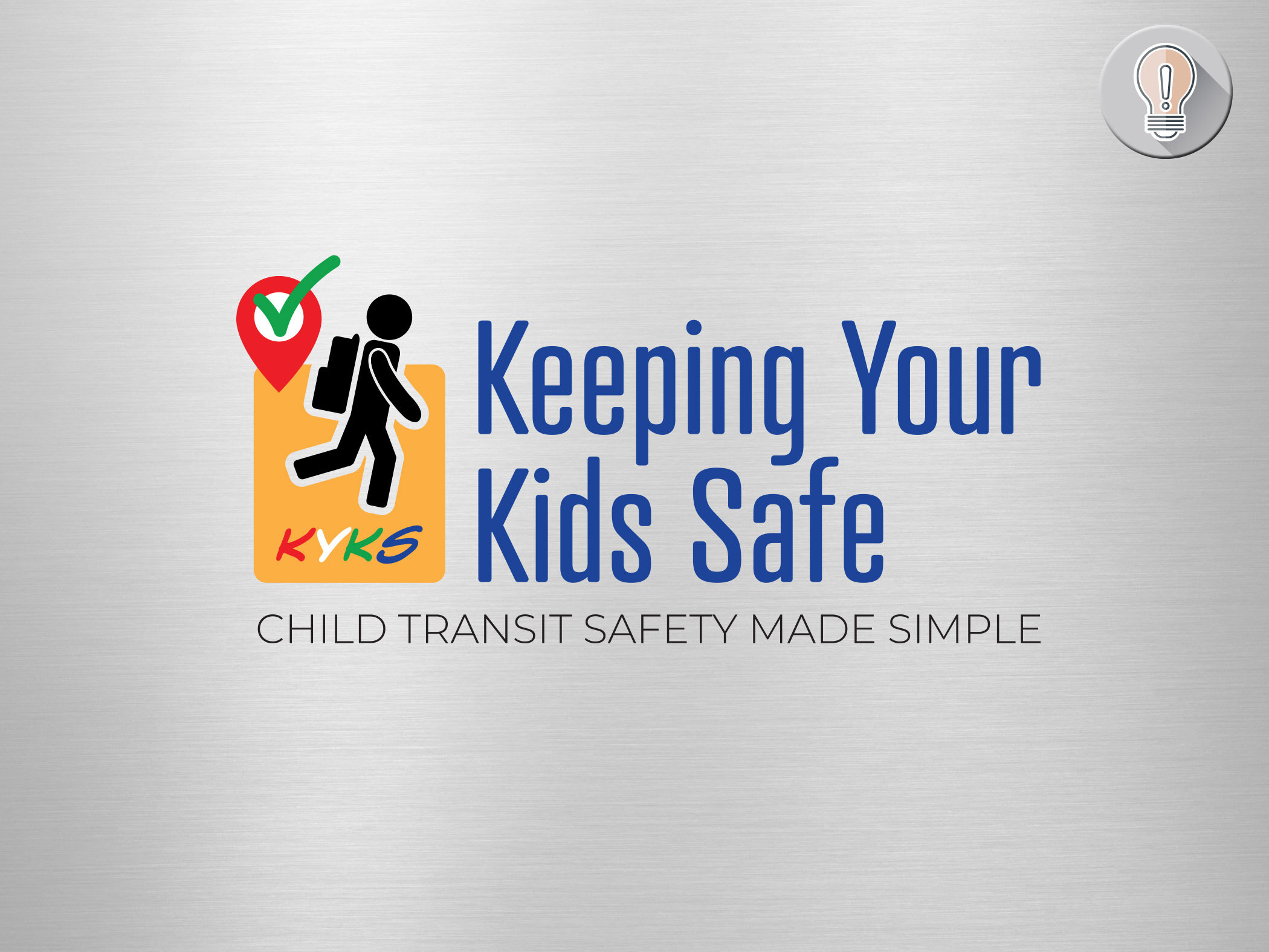
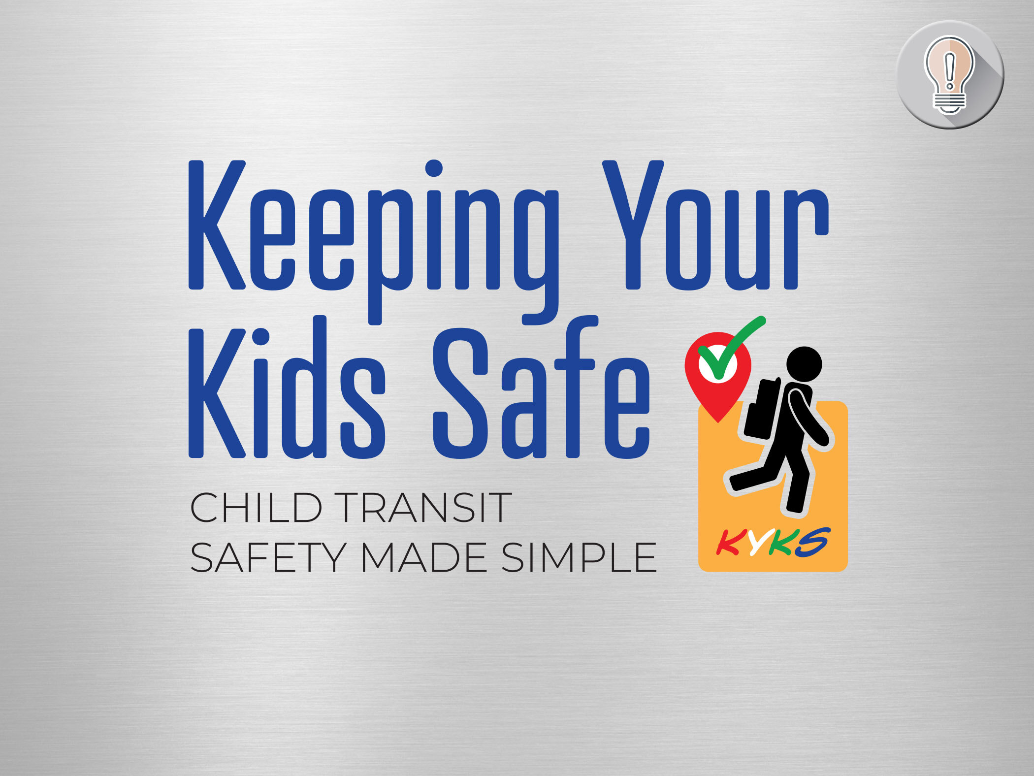
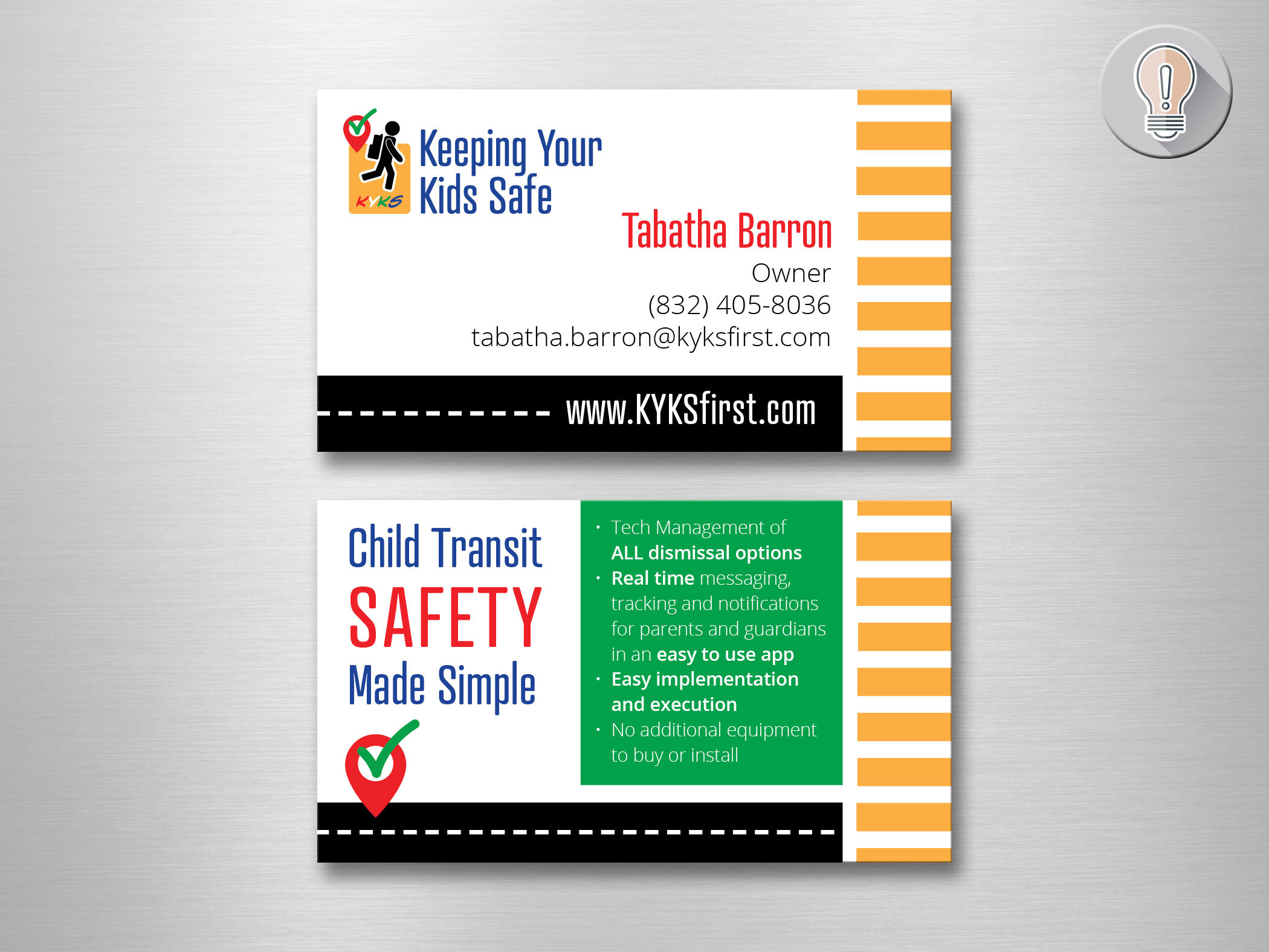
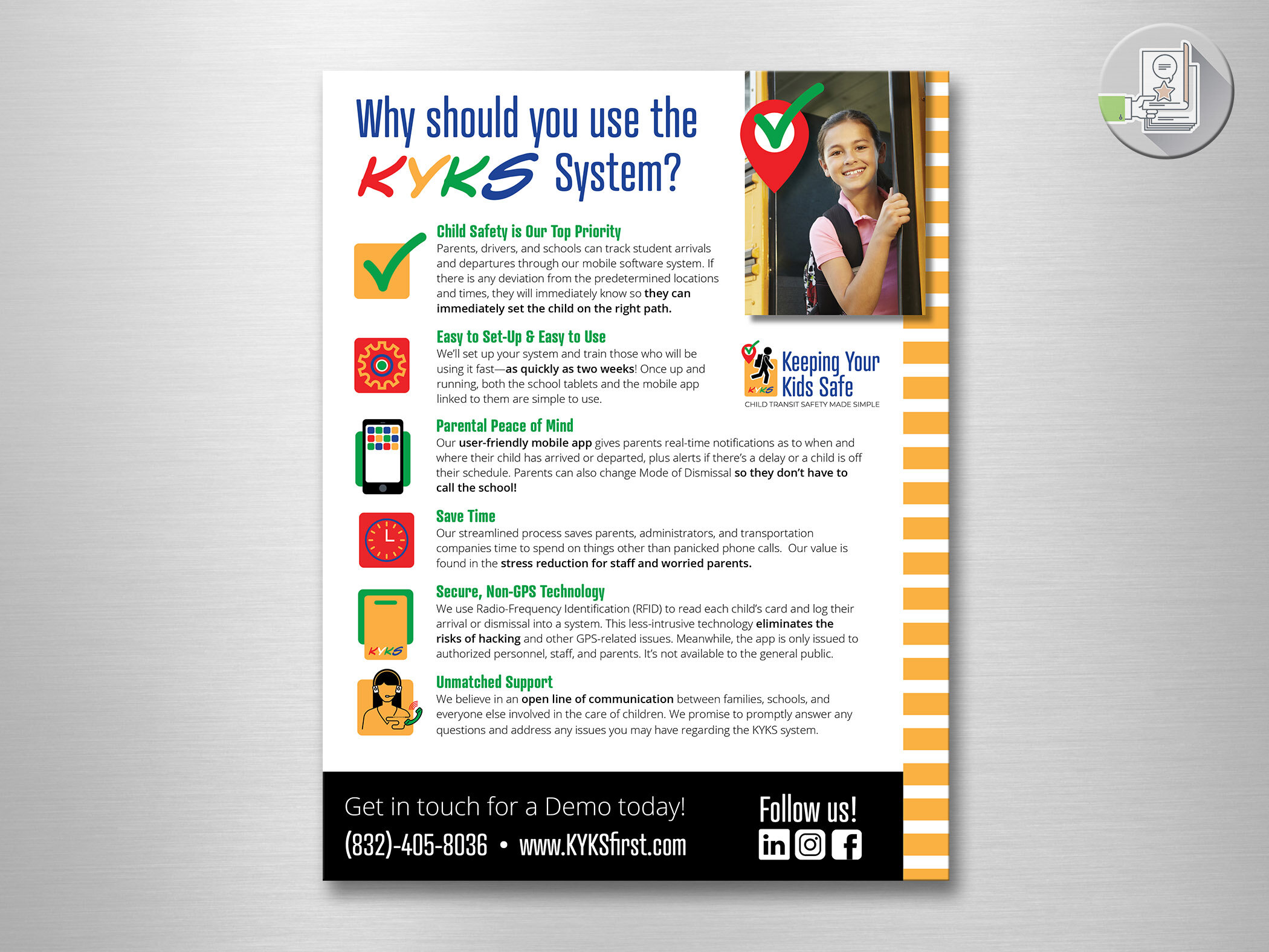
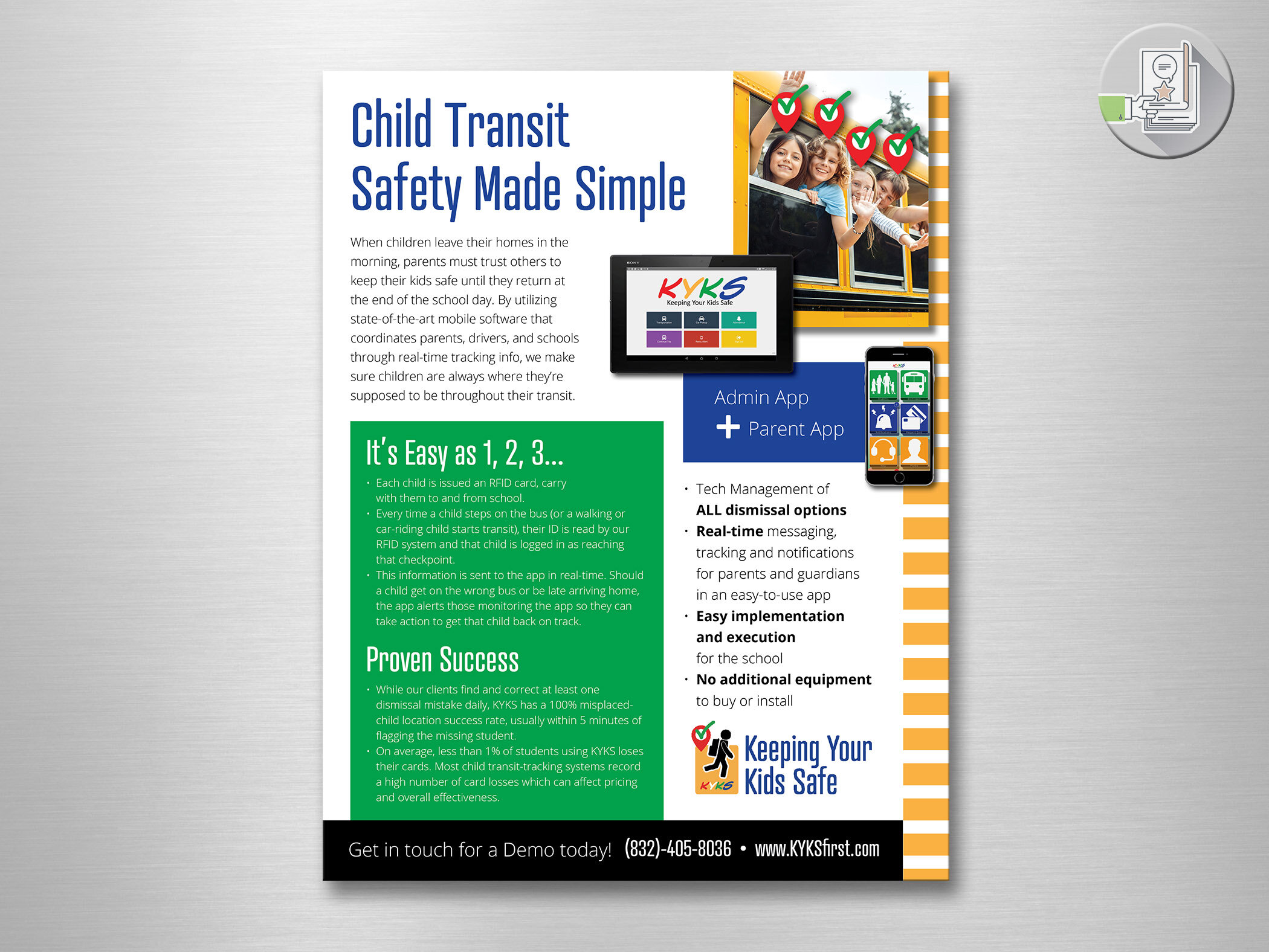
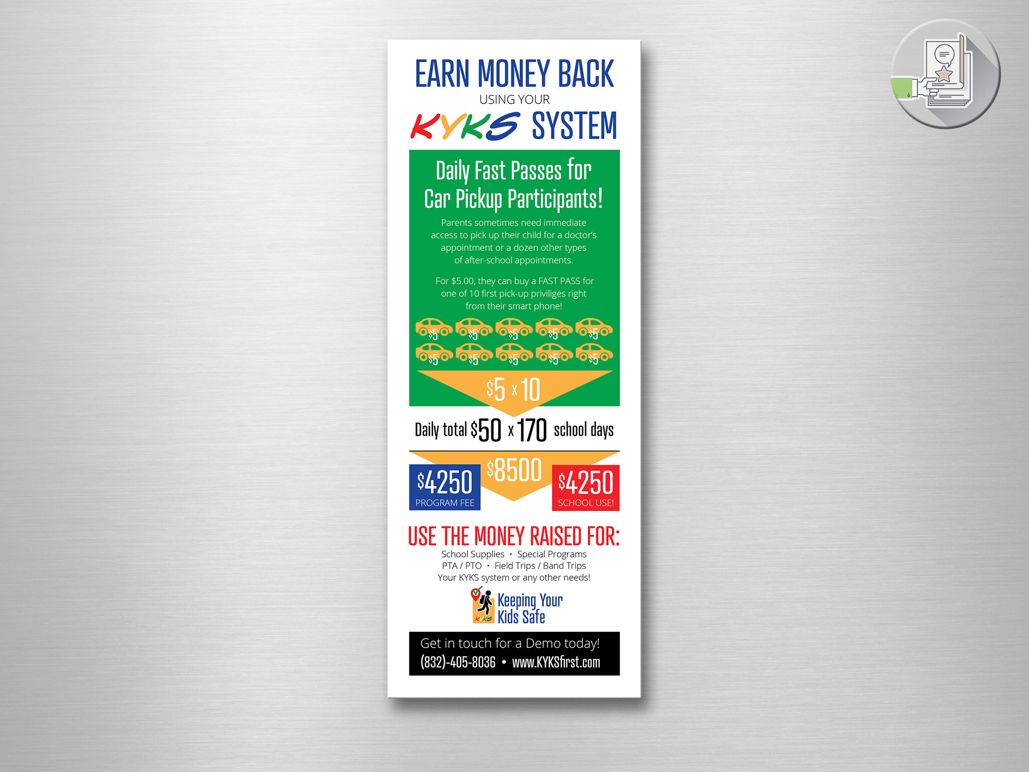
Keeping Your Kids Safe
Brand Identity
This client needed a bit more definition around the brand. I worked their current acronym logo into a larger concept new logo. I kept their color scheme - very identifiable as primary, fun, school-age colors. I gave them a moving child icon with a backpack to reinforce the school image, using the yellow bus color surround the child.
For the messaging, I teamed up with Write Hook Marketing Solutions to create a basic flyer and messaging that they could have as a solid foundation as they moved forward.
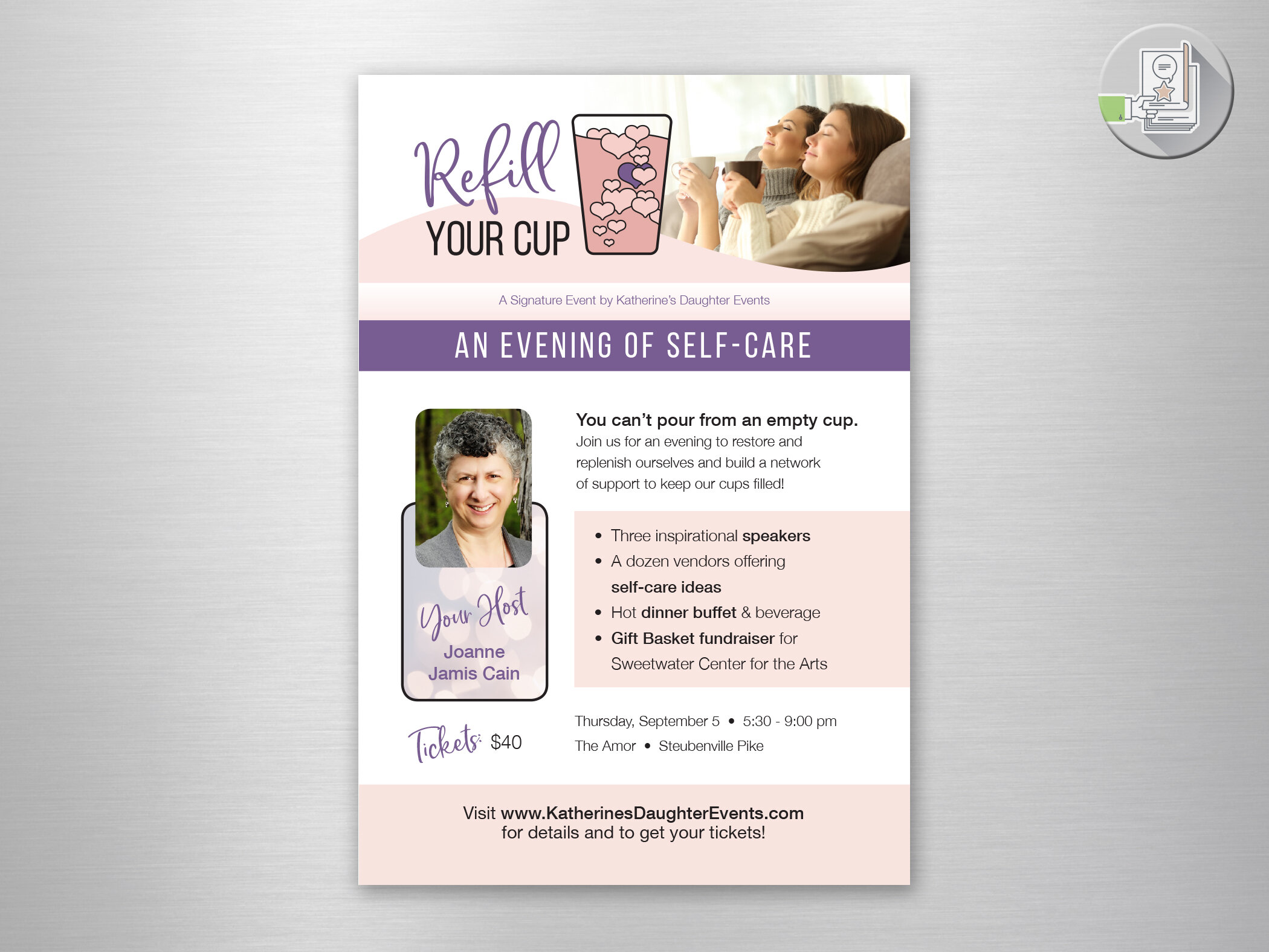
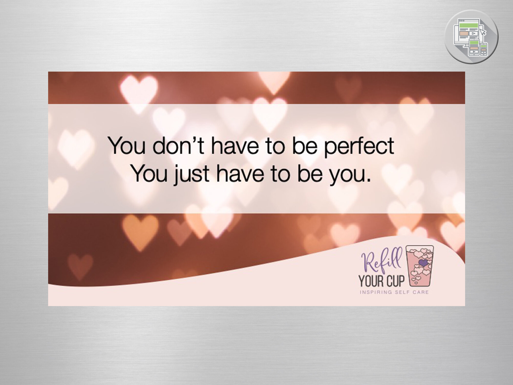
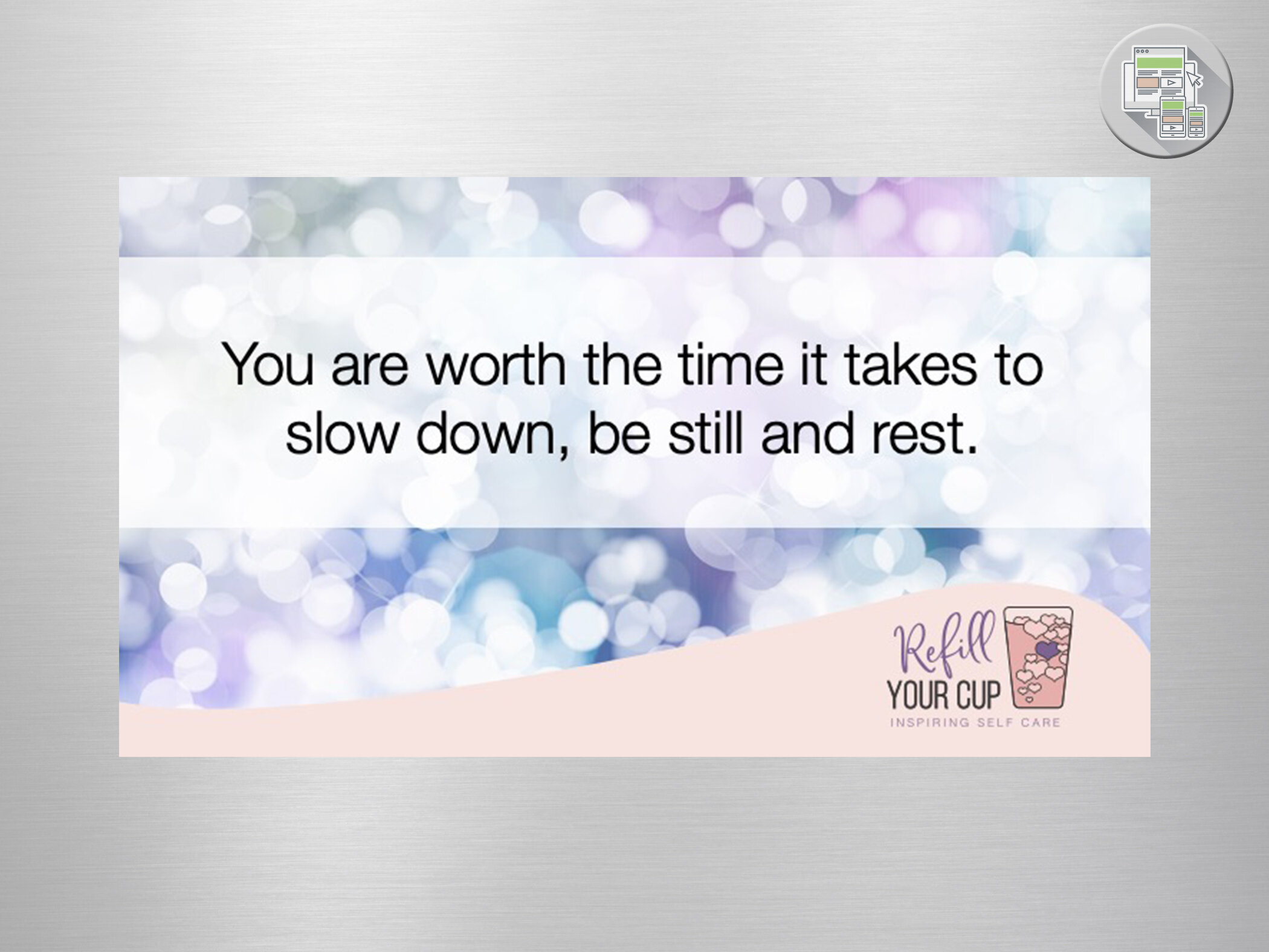
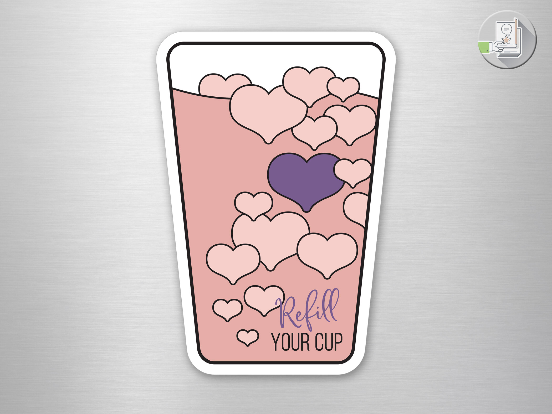
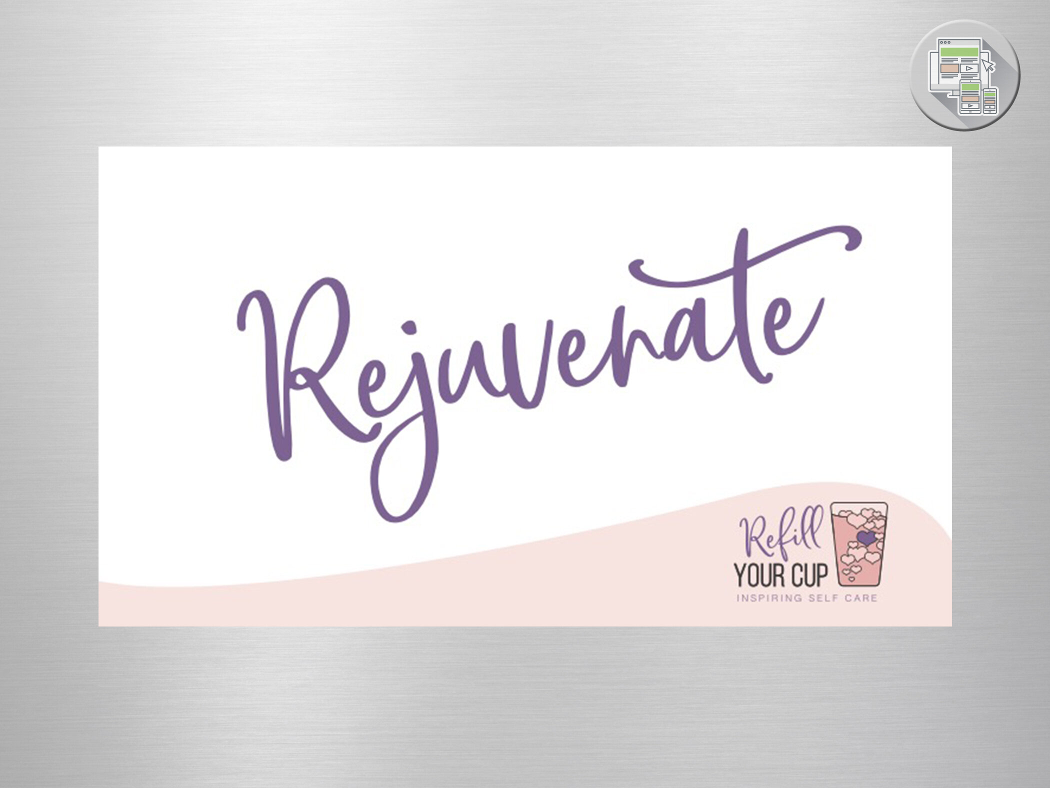
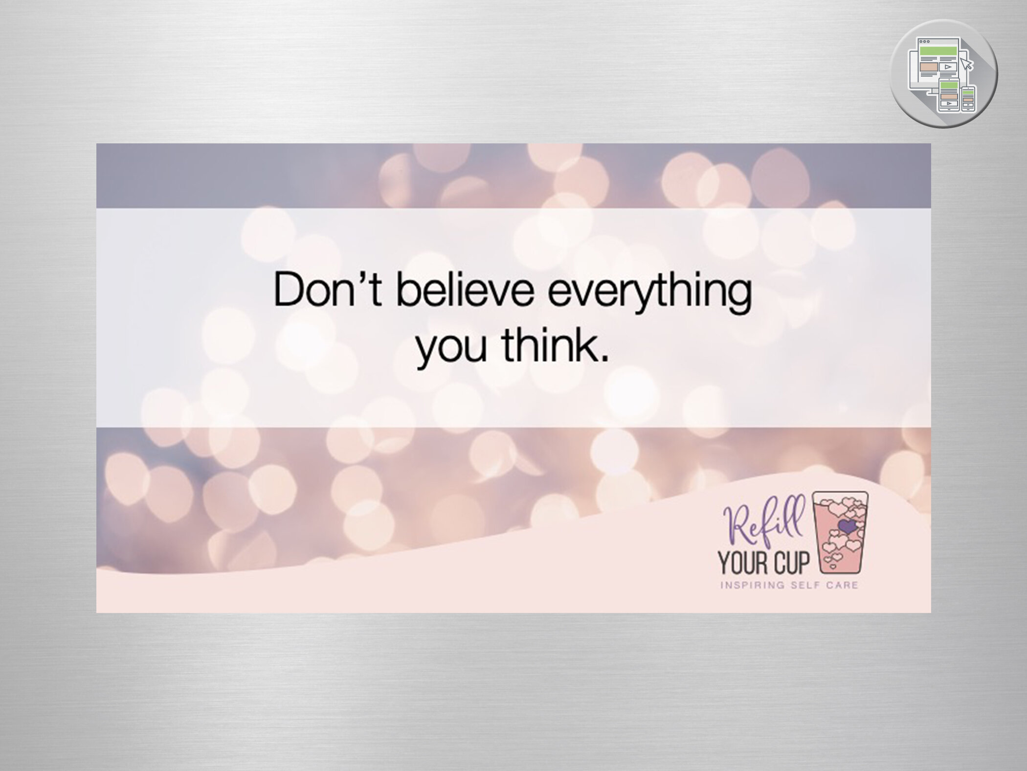
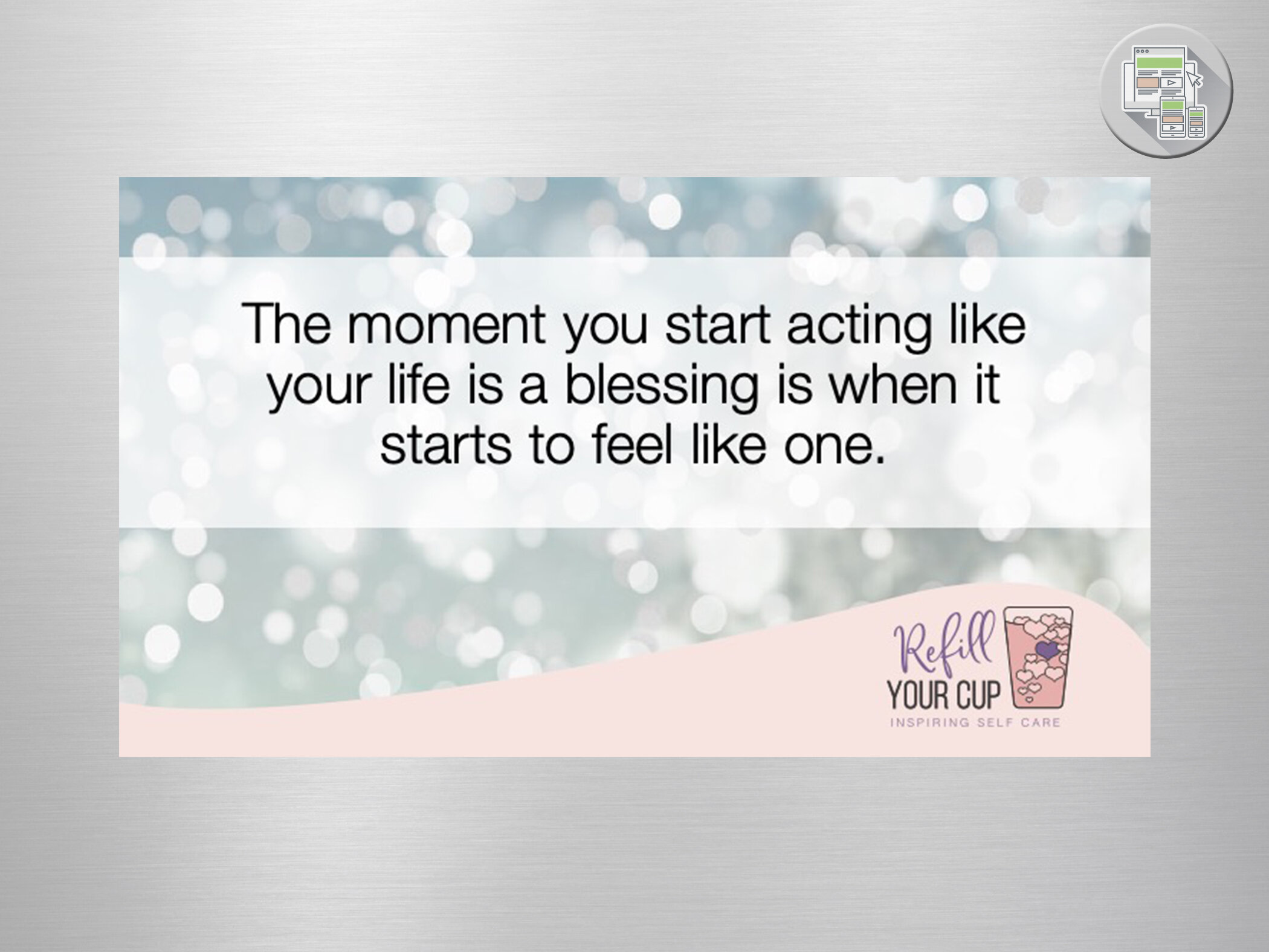
Refill Your Cup:
Event Branding
Joanne Cain of Katherine’s Daughter Events wanted to create an event that would be an evening of self care for the overwhelmed women who were in need of recharging. Based on the saying “you can’t pour from an empty cup”… “Refill Your Cup” was born. I was honored to provide the branding that advertised and created the atmosphere for the event. This included a “slide show” of images on rotation at the venue that were also used on social media leading up to the event.
Feel free to just relax and take a moment let those messages sink in.
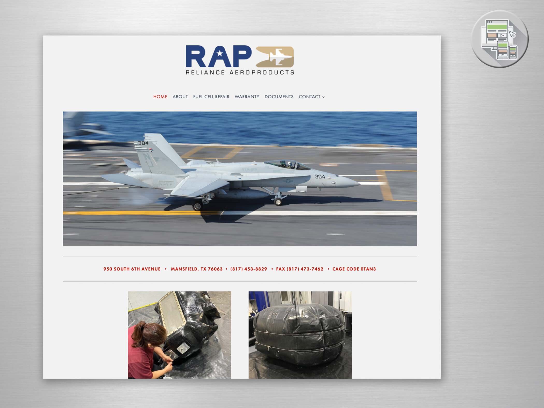
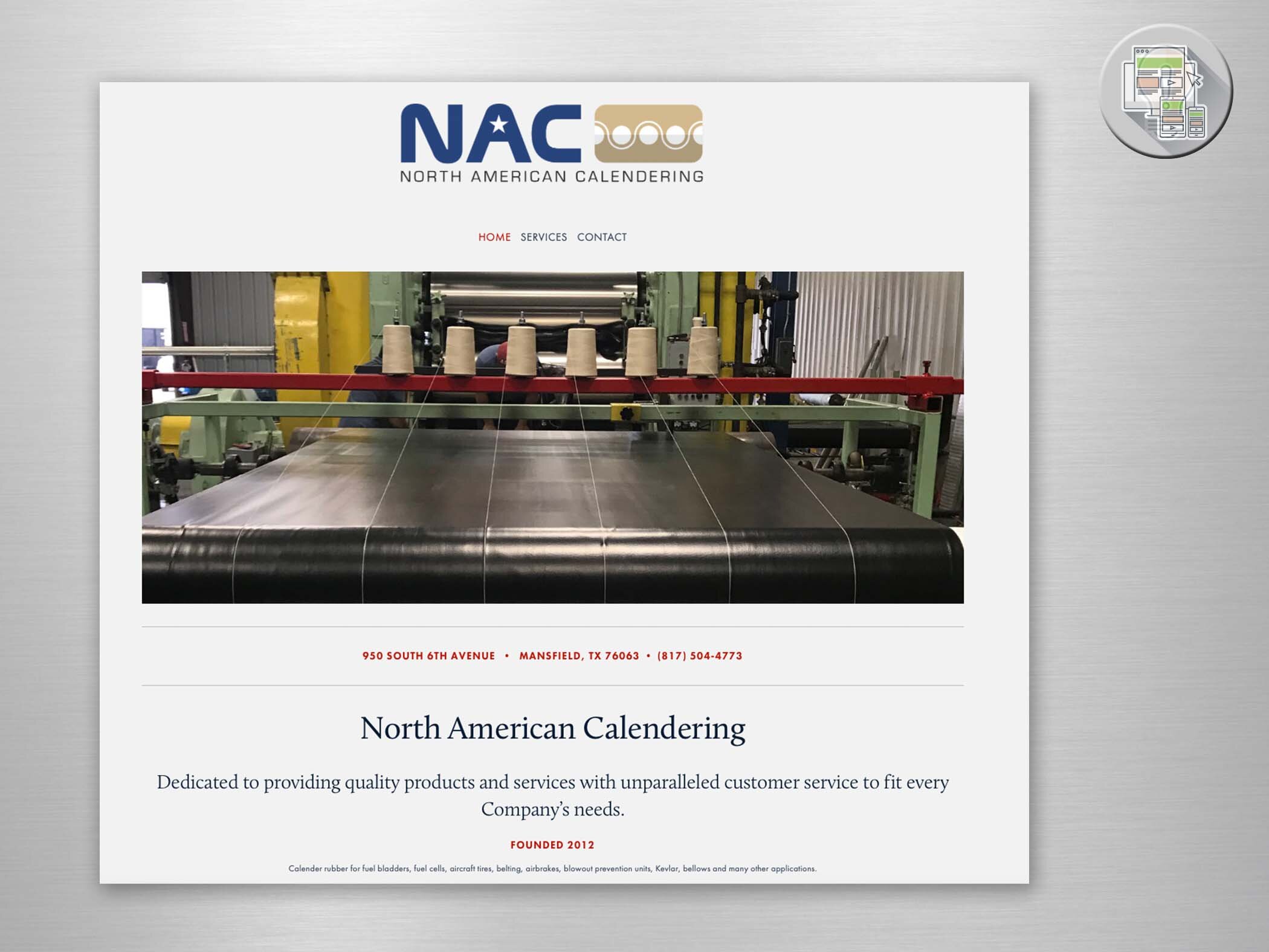
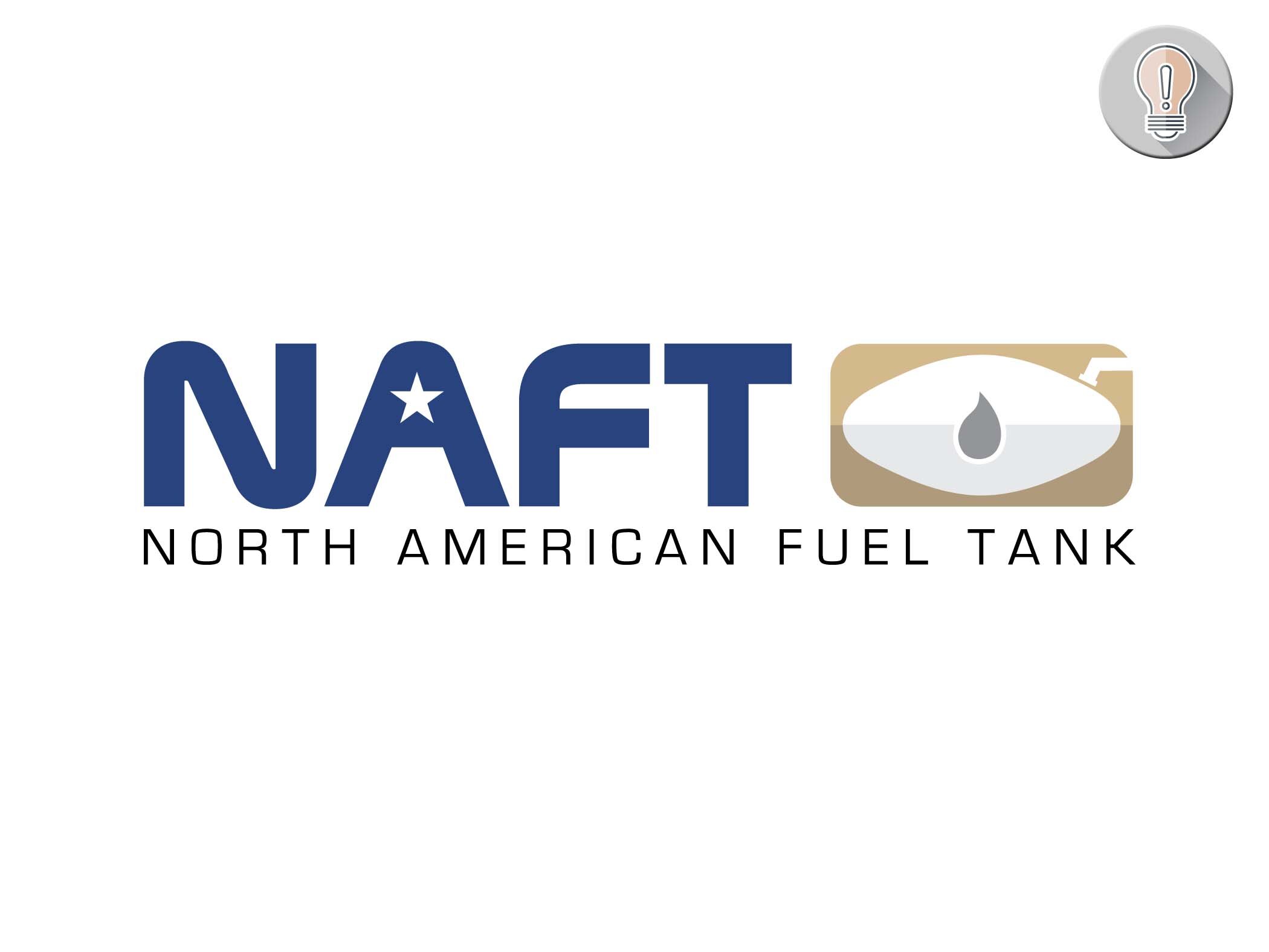
RAP • NAC • NAFT:
Branding
Three sister companies work together to provide products and services for aircraft with a strong military audience. The three logos had to have a strong association to deliver the message of synergy between the three. I also helped them with basic websites that communicated their products and services to their audience.

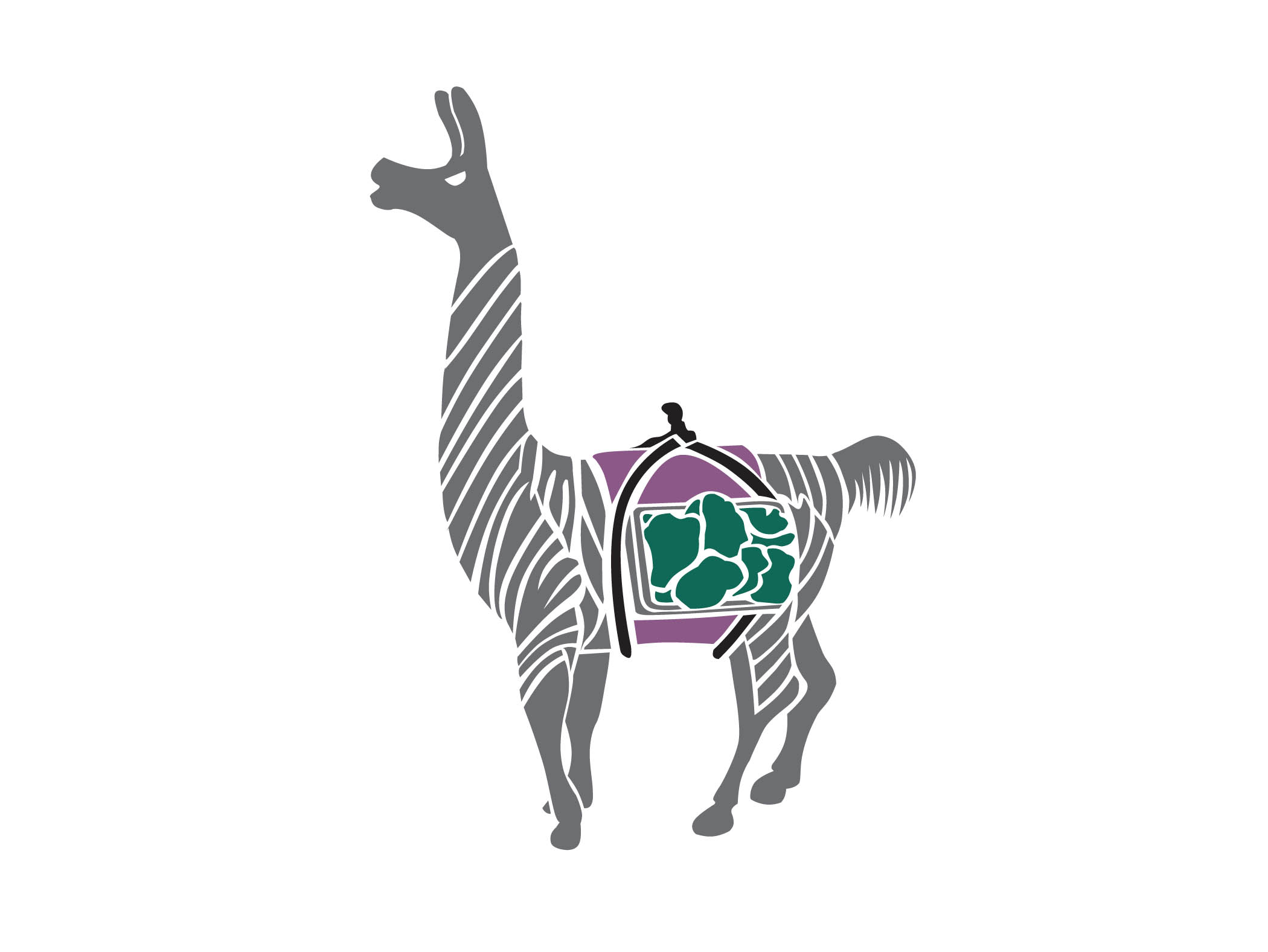
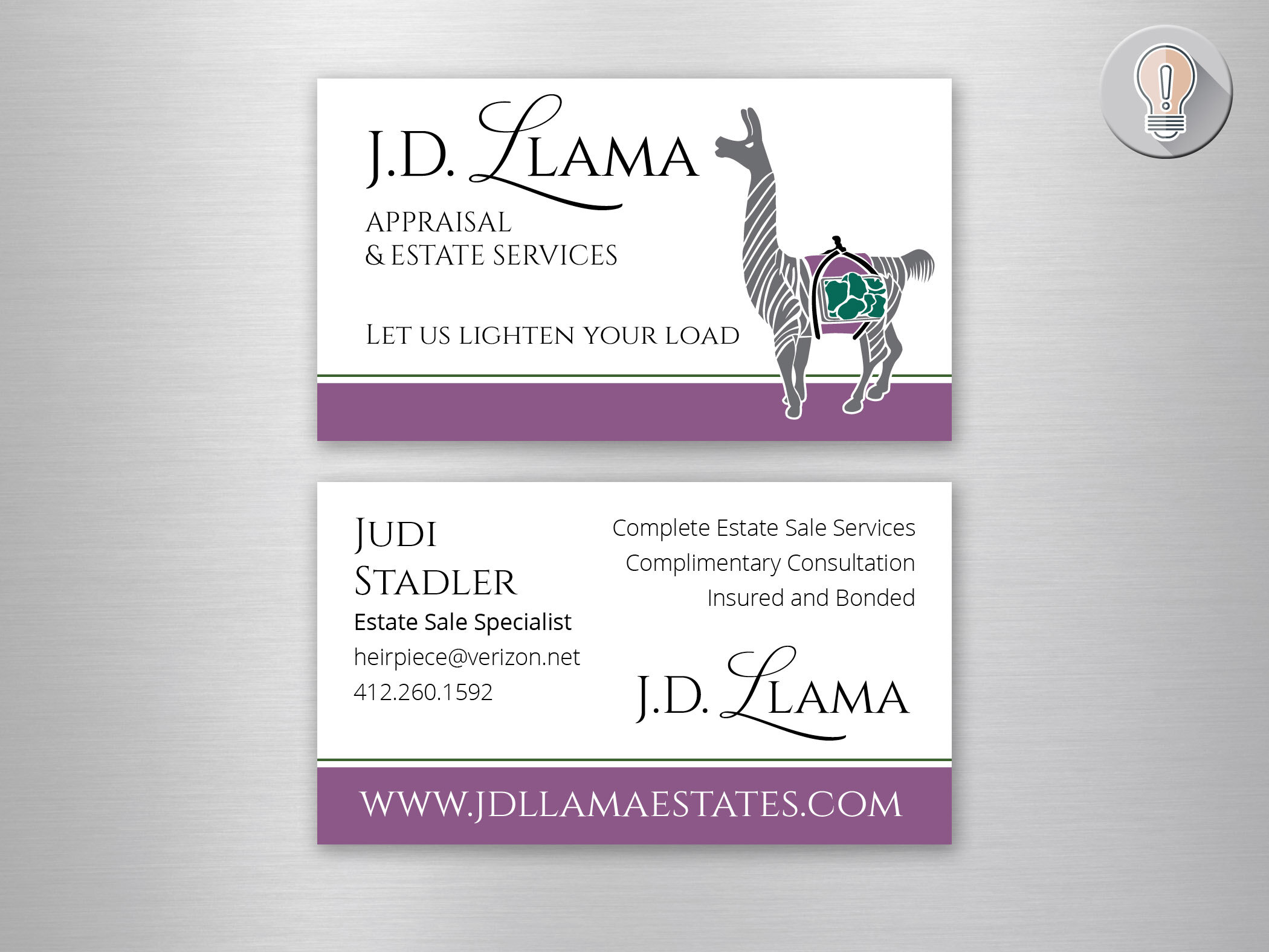
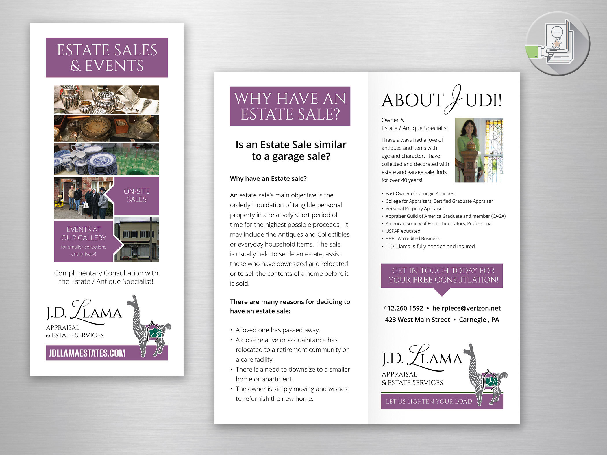
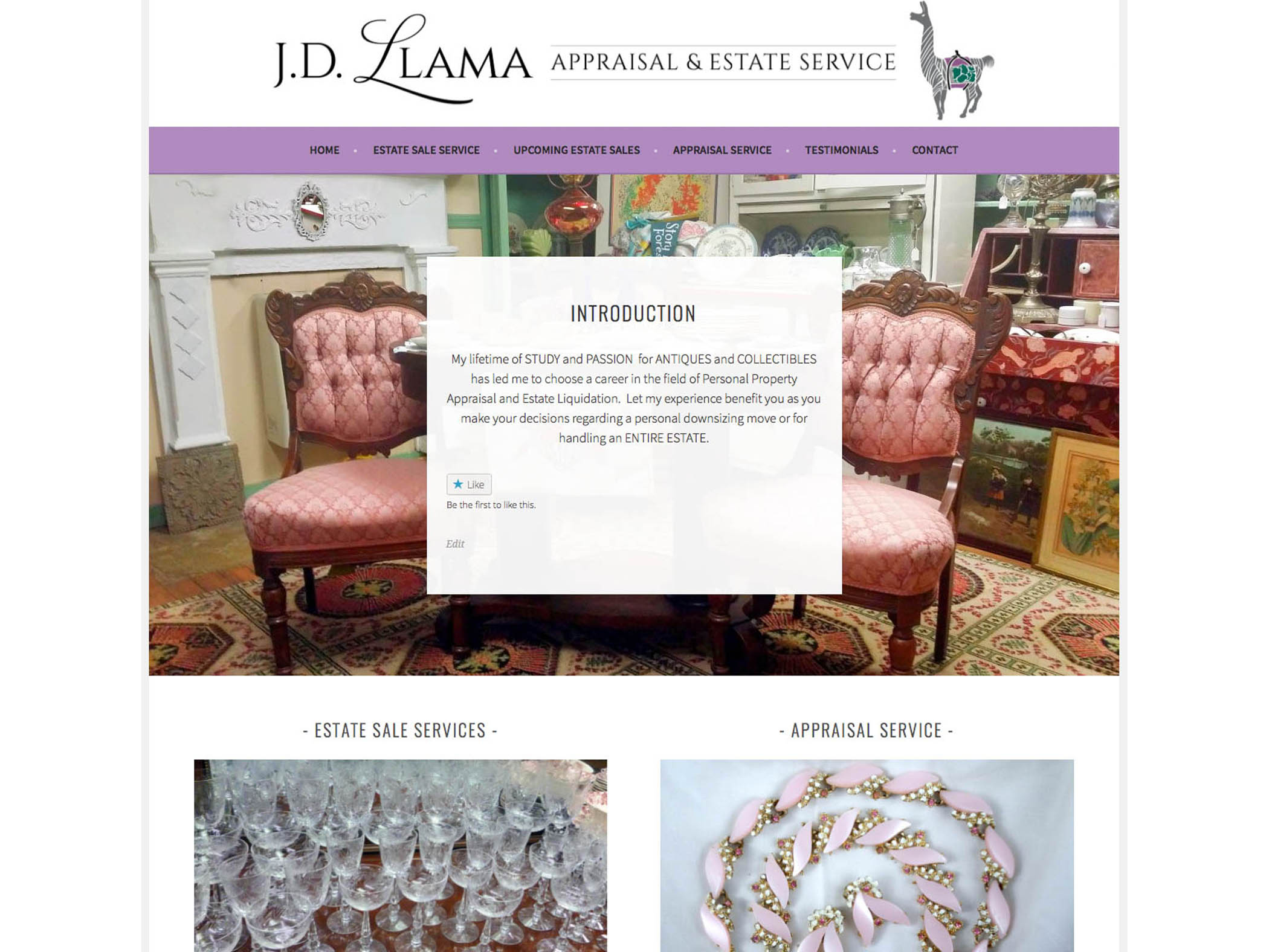
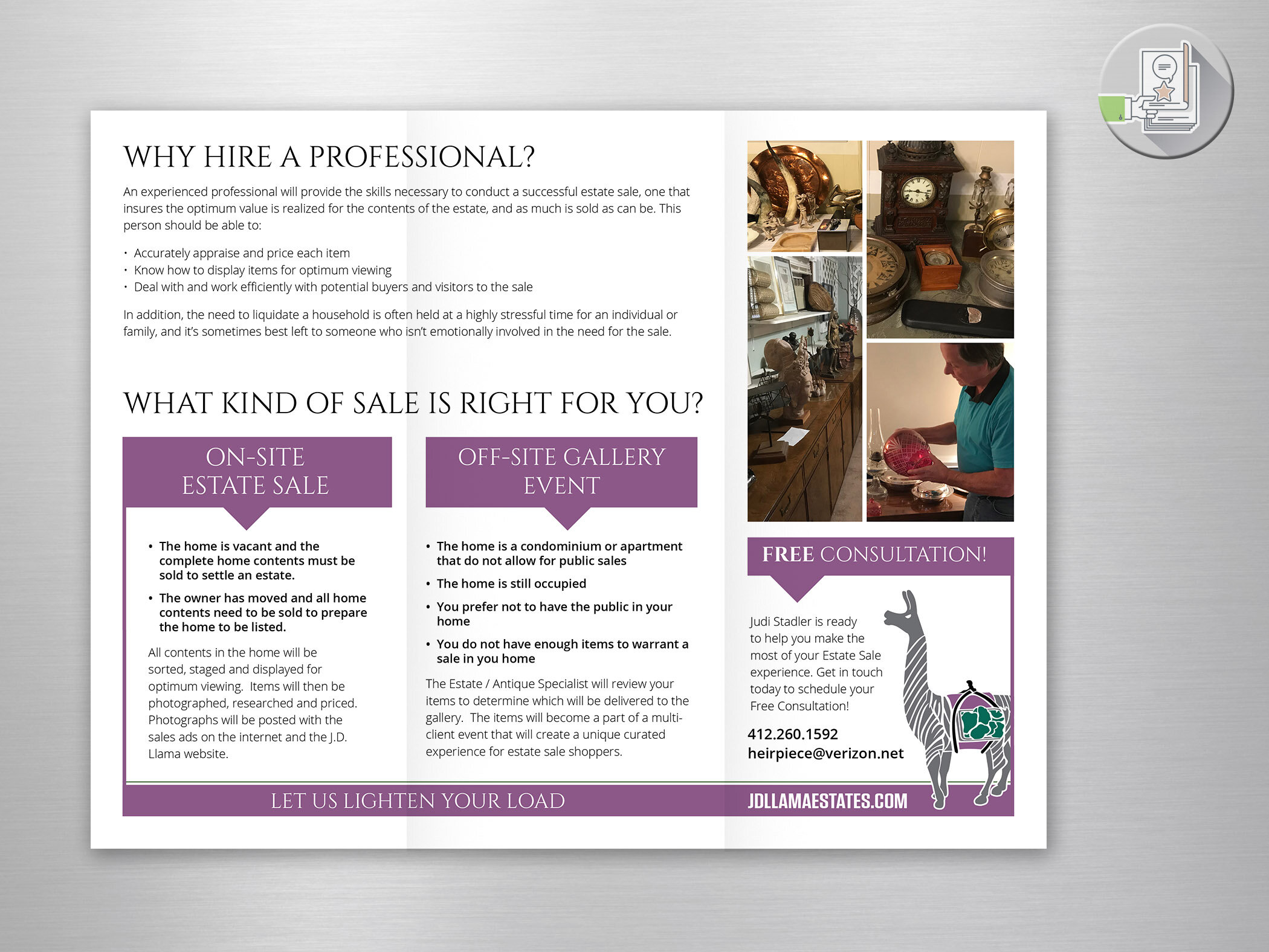
J.D. Llama Appraisal and Estate Service:
Brand Tweak
Not exactly a rebranding, but the addition of an icon. The llama icon was based on a cherished item belonging to the owner.
I designed a new business card for her that featured the new icon. I also added the icon to the J.D. website and tweaked the coloring and header to match the card.
Sometimes a few tweaks is all you need!
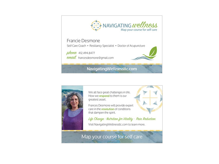
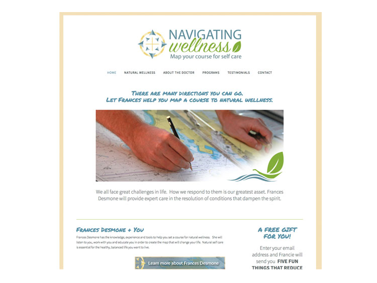
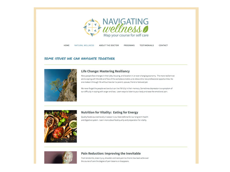
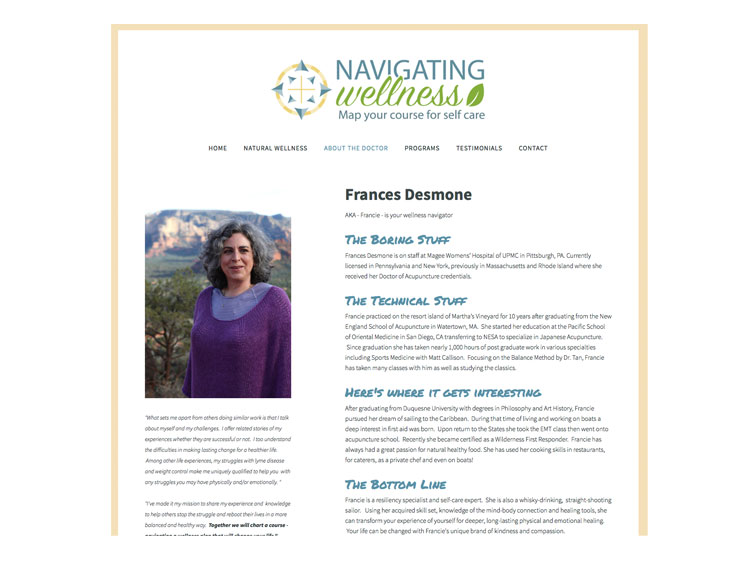
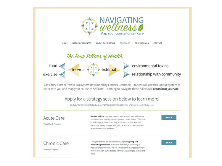
Navigating Wellness, LLC:
Brand Identity
At the first meeting this client's speech was peppered with nautical terminology. Being a sailor is part of who she is, and I knew right away that a nautical inspiration would help develop this brand.
I gave her a serene, seaworthy palette with icons and imagery that support her program of natural self care. We positioned her as a wellness navigator - equipped to help you on your wellness journey.
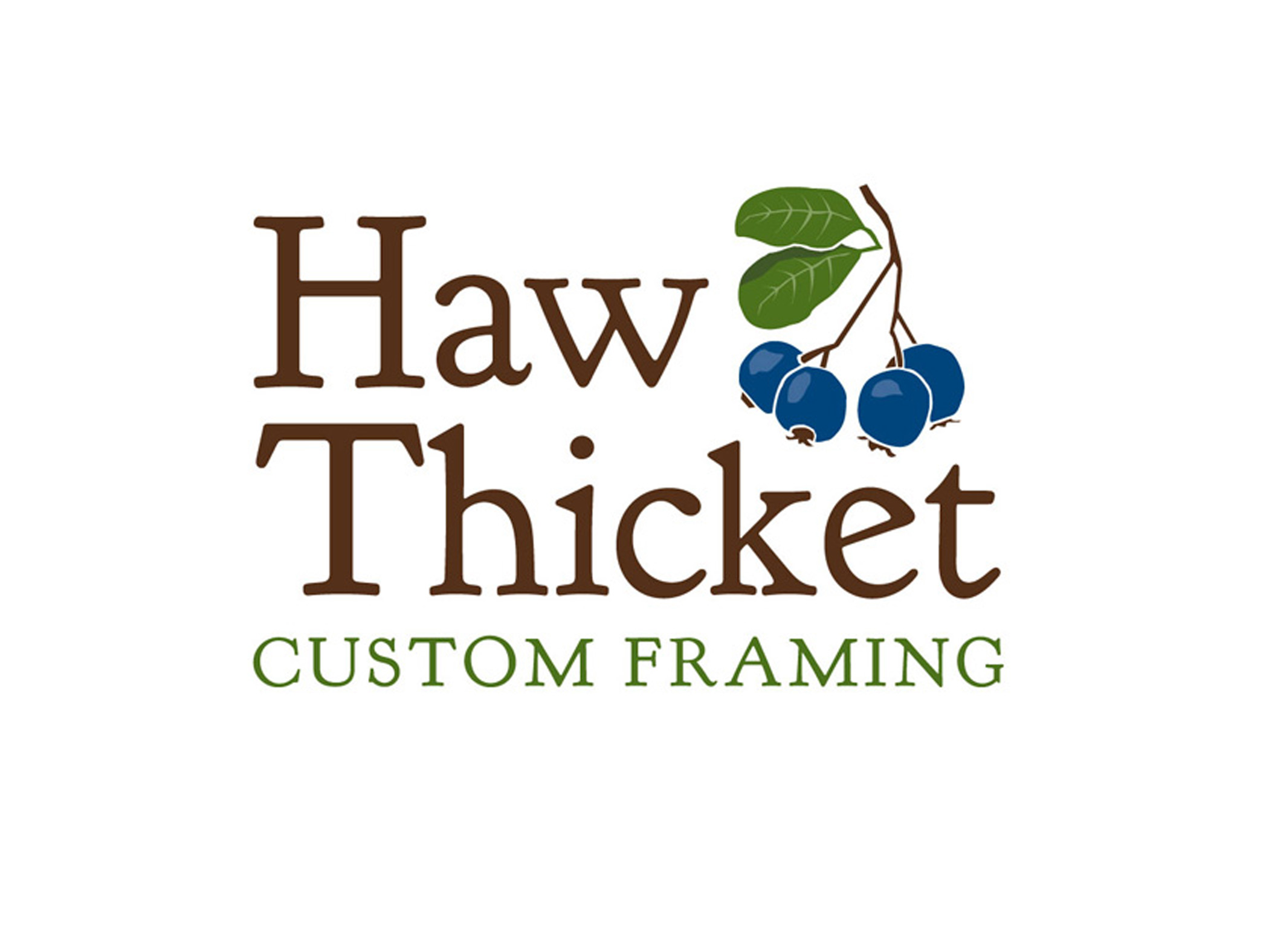
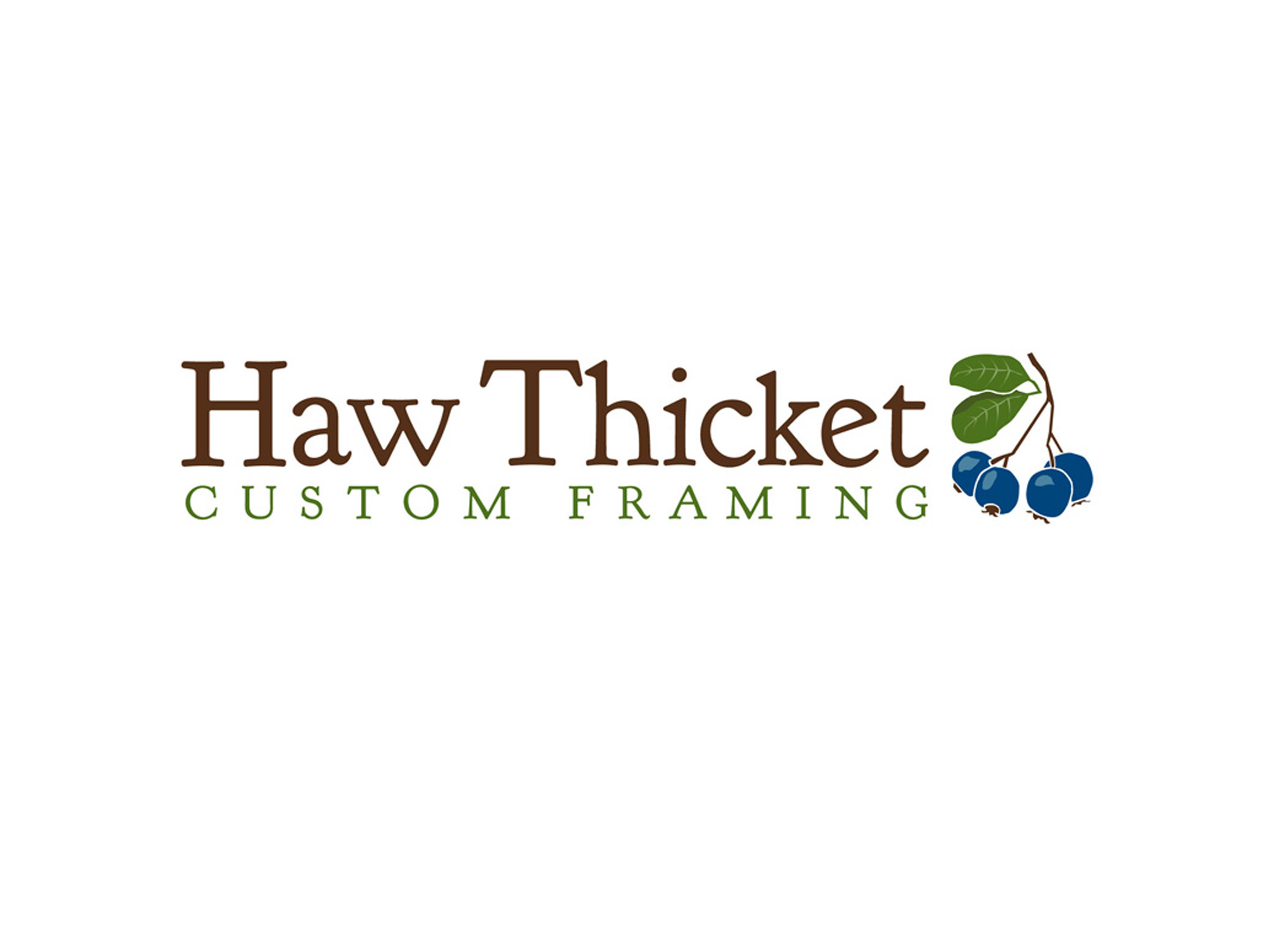
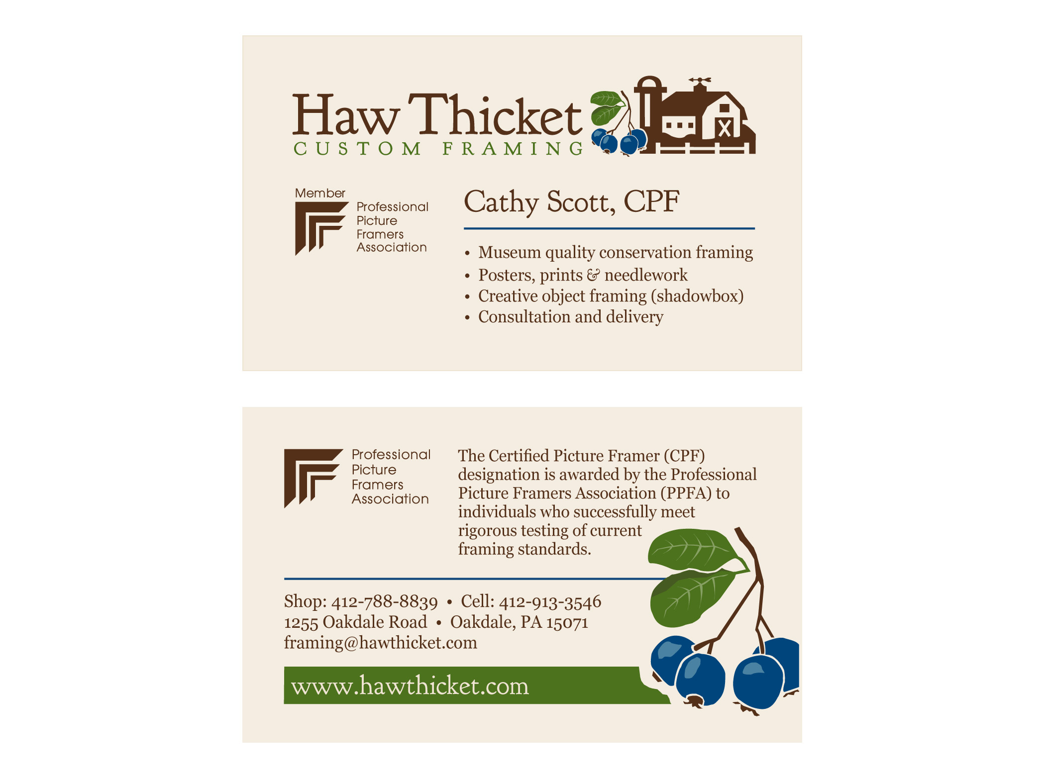
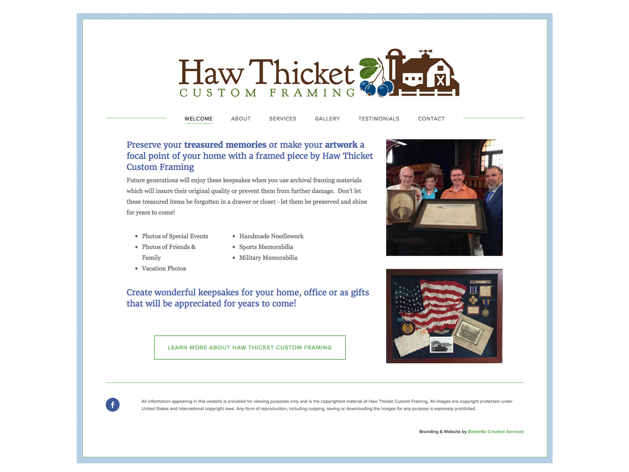
Haw Thicket Custom Framing
Brand Identity
This client works out of an office in her home - located on a Dairy Farm. The land drew its name from the Haw tree, so I created haw berries as her graphic element. The font is a soft, traditional one that coordinates well with the berries.

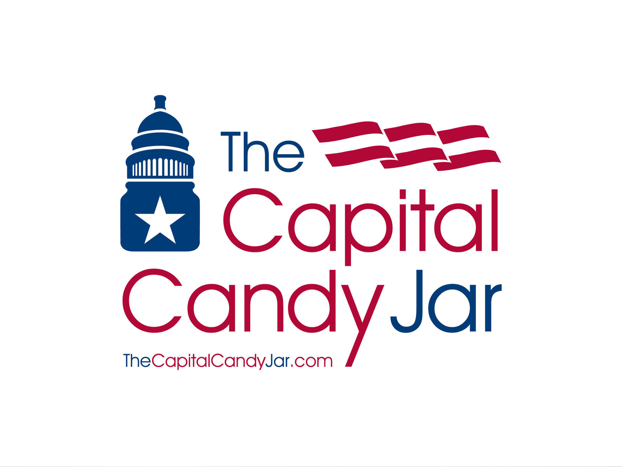
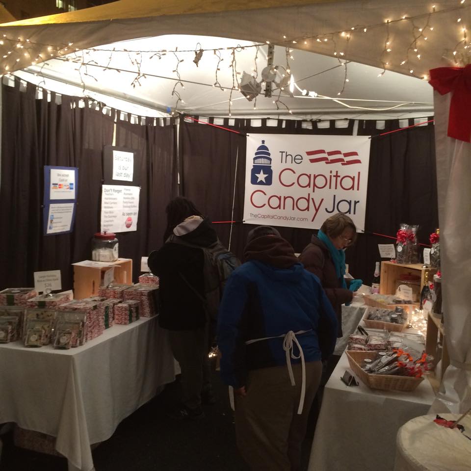
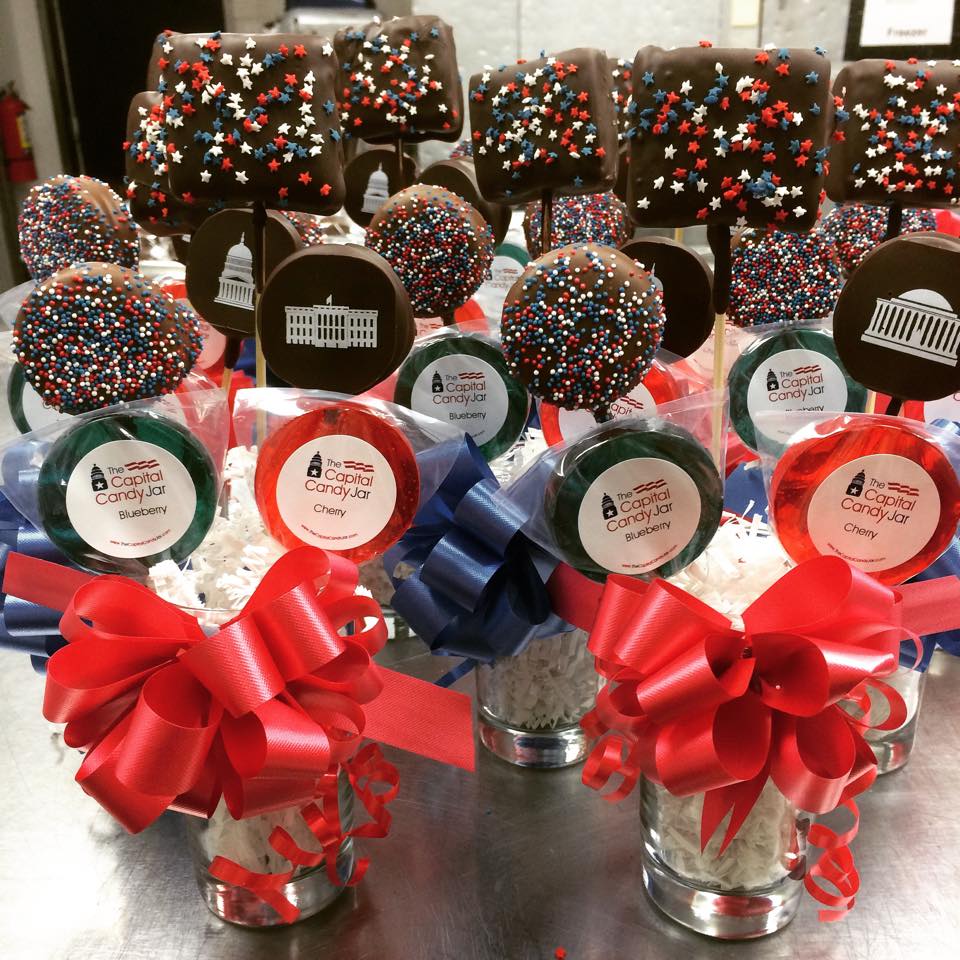
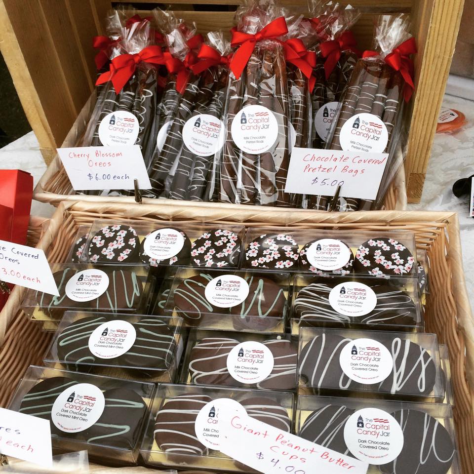
The Capital Candy Jar
Logo Design
This is a Washington D.C. based business... in case you didn't know. The color palette was a no-brainer, and I created the lid of the "candy jar" based on the dome of the Capital building.
Star + stripes + a modern, clean font and you have a logo for some gourmet goodies.
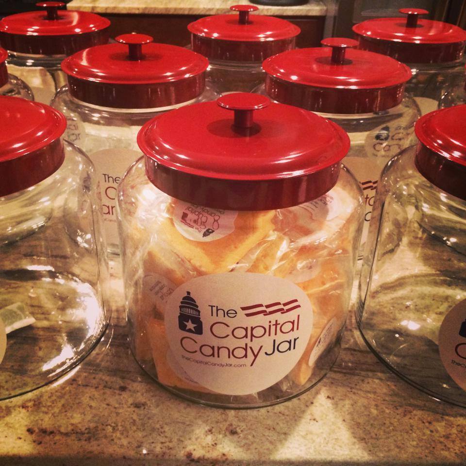
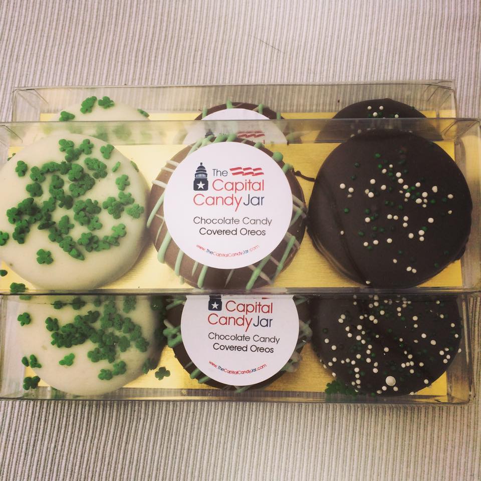
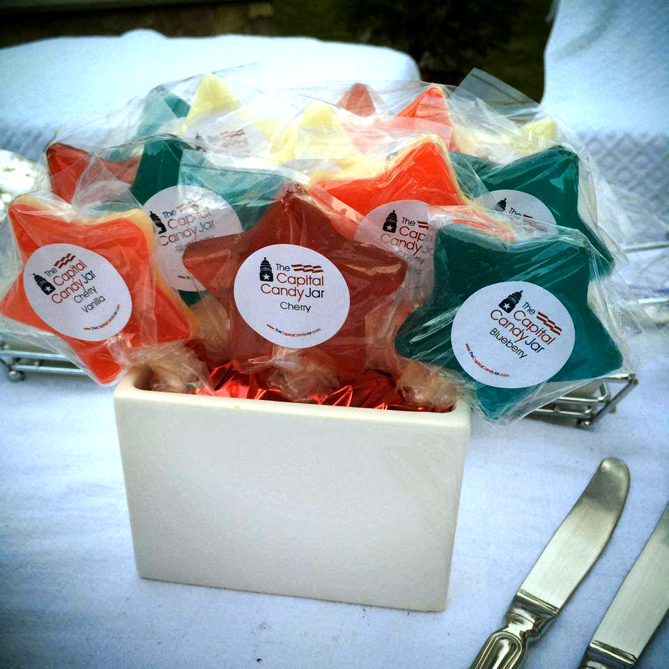
There are some photos here of the logo in action. My apologies if you are now hungry.